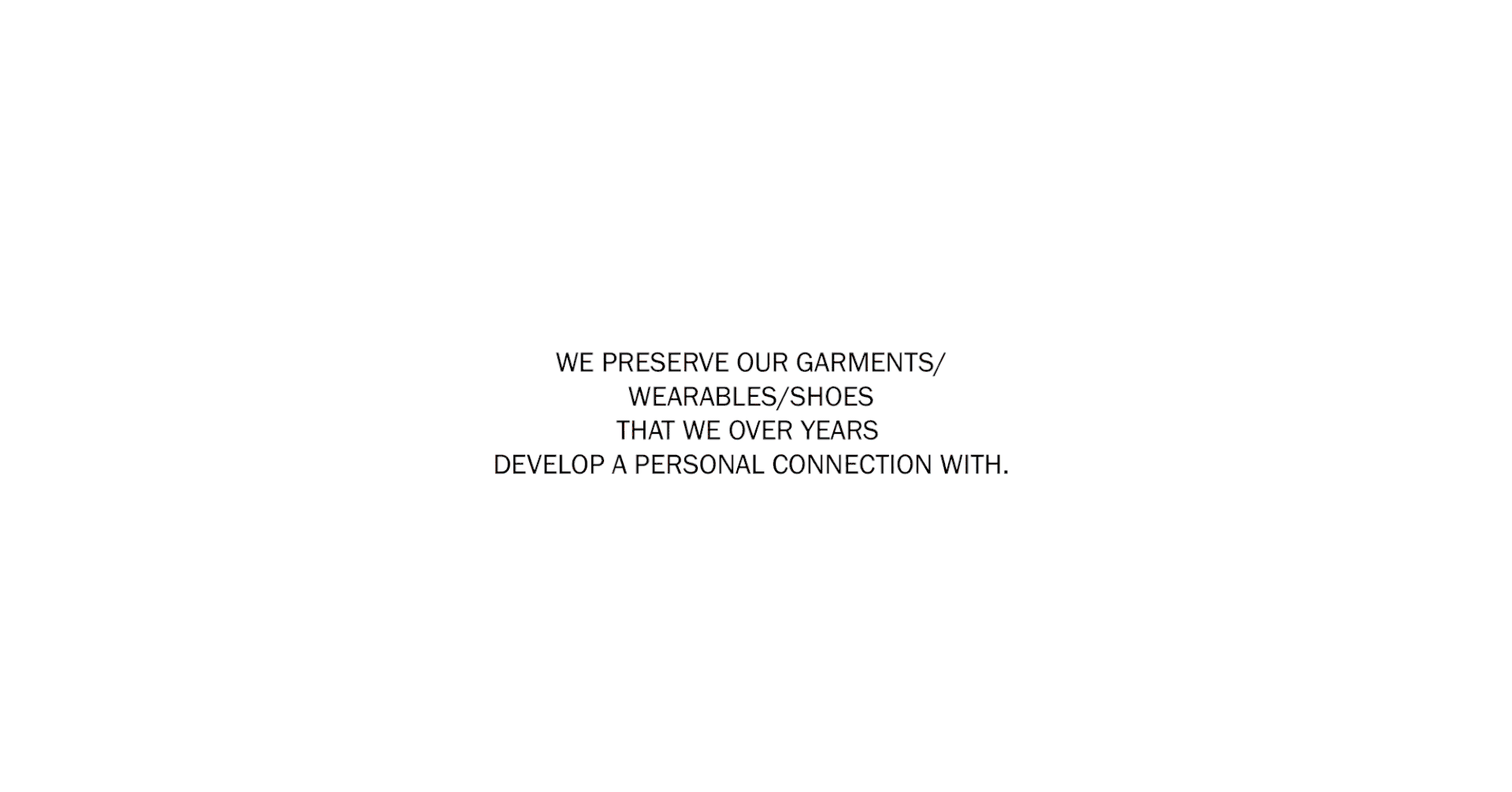
THE BACKGROUND
Pressto- the Spanish pioneers of dry cleaning industry, were expanding there stores and outreach in India. Present in India with 42 stores up and running in Delhi and Mumbai, Pressto was now setting foot in South, launching its stores in Bangalore. The brand has already earned a good base of regular valued customers with its expert dry-cleaning services and an unmatched customer satisfaction.
THE BRIEF
Develop a Visual communication strategy, that will help drive Pressto its communication, branding and marketing objectives, during their expansion and store launch.
THE APPROACH
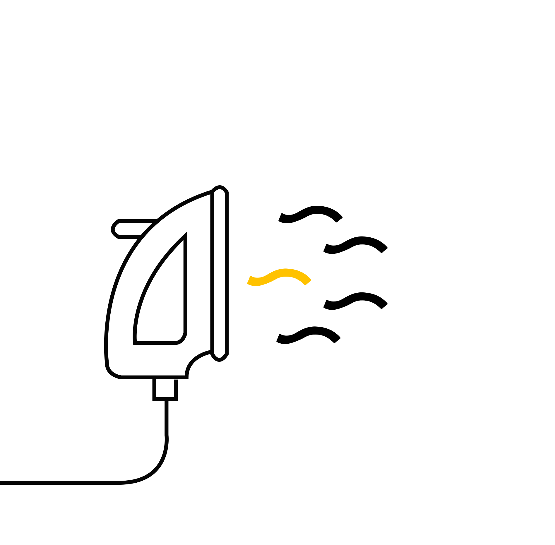
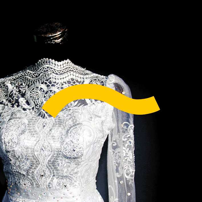
Maximising on the existing brand assets and reinforcing - Pressto's professionalism,
we extended the existing language of the Pressto Yellow Stroke.
The Pressto stroke defines the expertise, precision and the quality delivered by Pressto,
translating as the experts touch in brand semiotics.
MAKING PRESSTO, LOOK PRESSTO
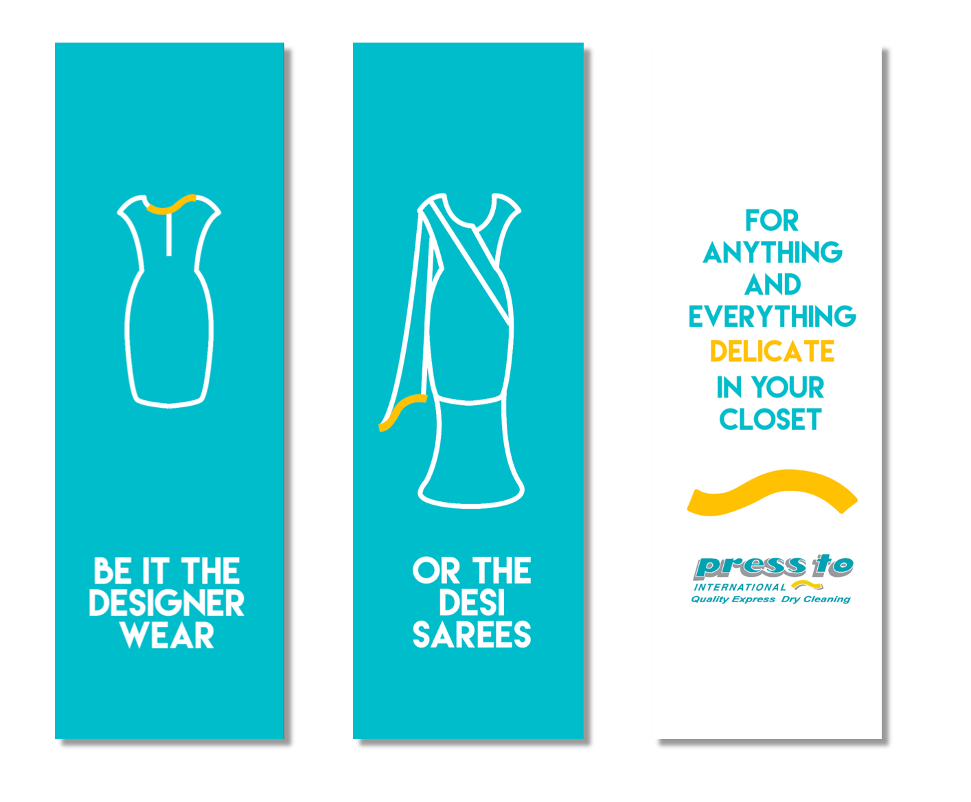
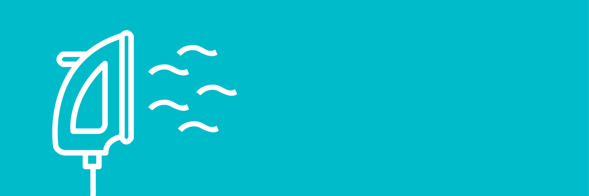
GRAPHICS AND VISUALS-The graphic usage of Pressto stroke, the yellow brand mark stands out distinctively for usage with both icons ( to show the variety of services - Dry Cleaning as well as Cobbler) and imagery ( primary used for communication purposes).
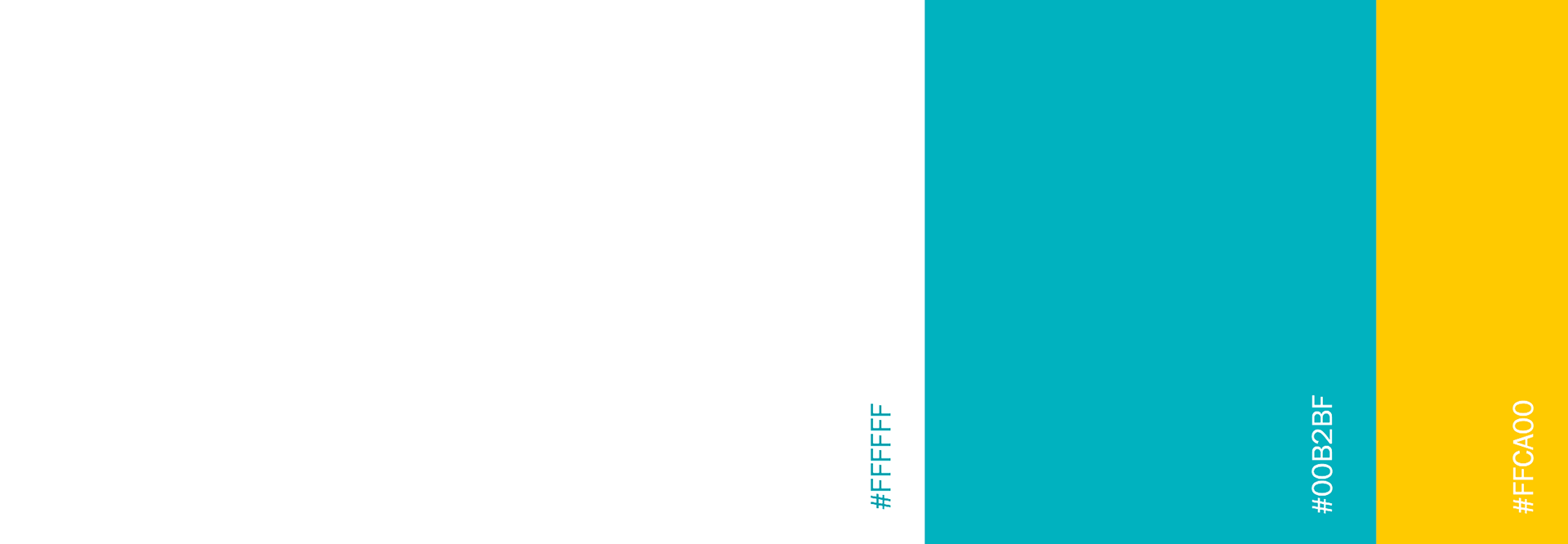
COLOURS-The brand colours are vibrant and inviting, and same proportions of colours (as in logo) to be used through out branding elements.While the dominant use of white cues in cleanliness, the brand colours used in patches and text, adds dynamism. The use of shadows and Grey has been eliminated and a flat style has been adapted.
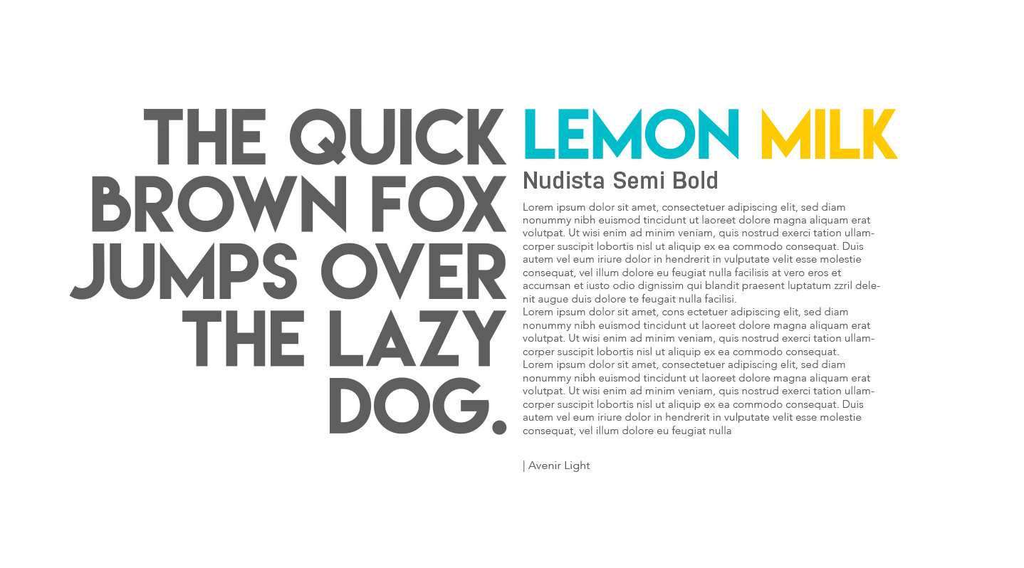
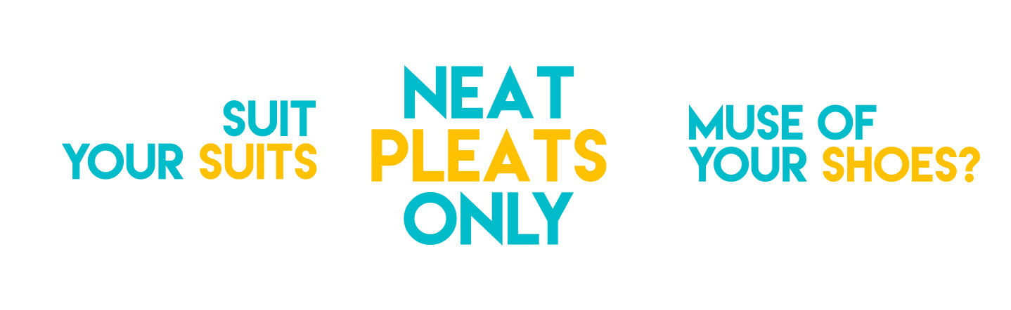
TYPOGRAPHY-Bold and minimal, contemporary Sans serif typeface – Lemon Milk makes sure the communication stands out crisp and is never missed.
The play of colours between brand Turquoise and Yellow, creates hierarchy in communication layouts.
SOUND AND TONALITY-Though we are pioneers and experts in our services, what distinguishes us is our friendly service to our customers. Our communication is always crisp, accompanied with a wit and style of trustworthy caretaker ,who knows the best of your wardrobe needs. The classic Spanish tap dance tempo makes Pressto sound Pressto for Audio branding purposes, and makes the brand more approachable and friendly.
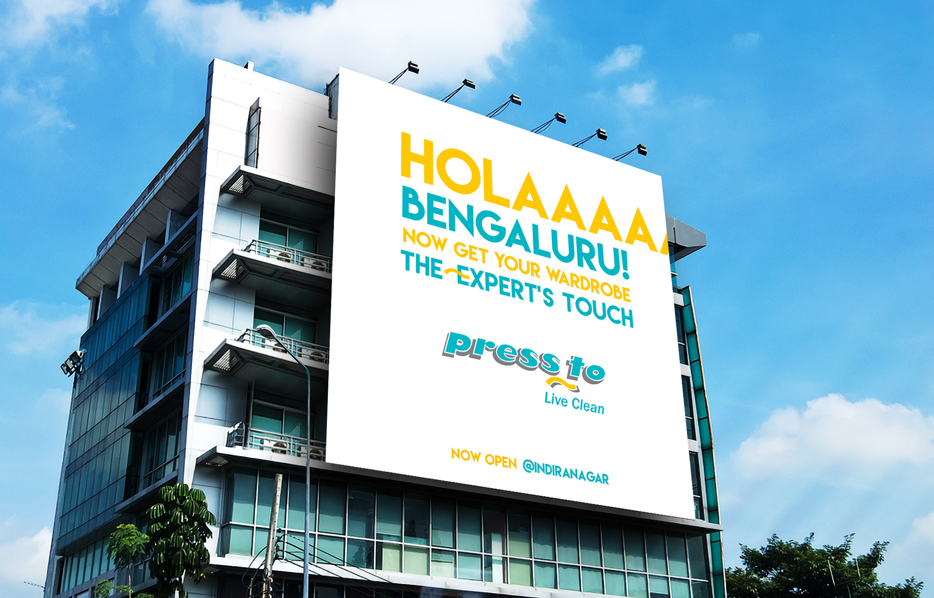
Launch Communication - saying Hi to the city, with the traditional Spanish HOLA!
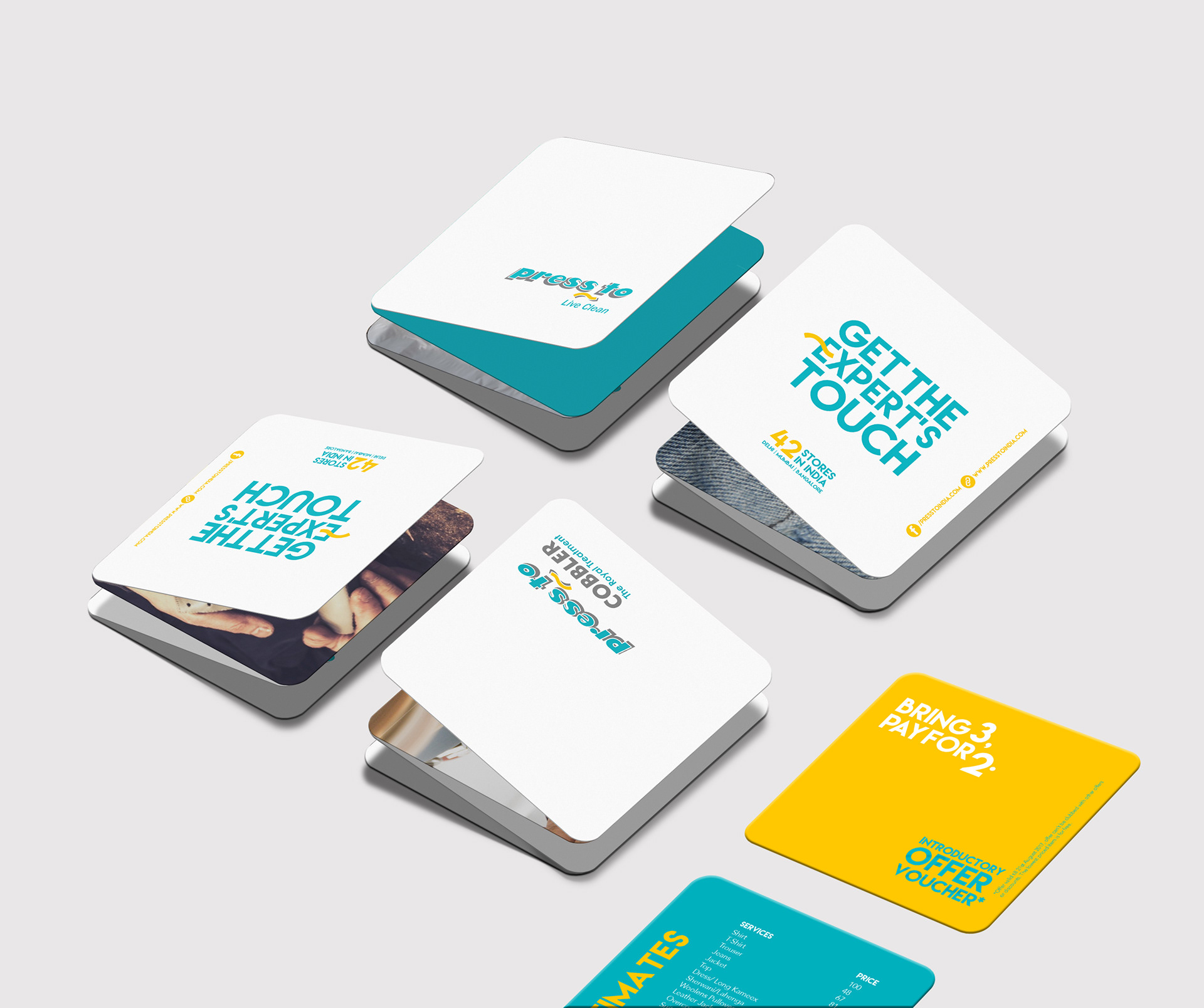
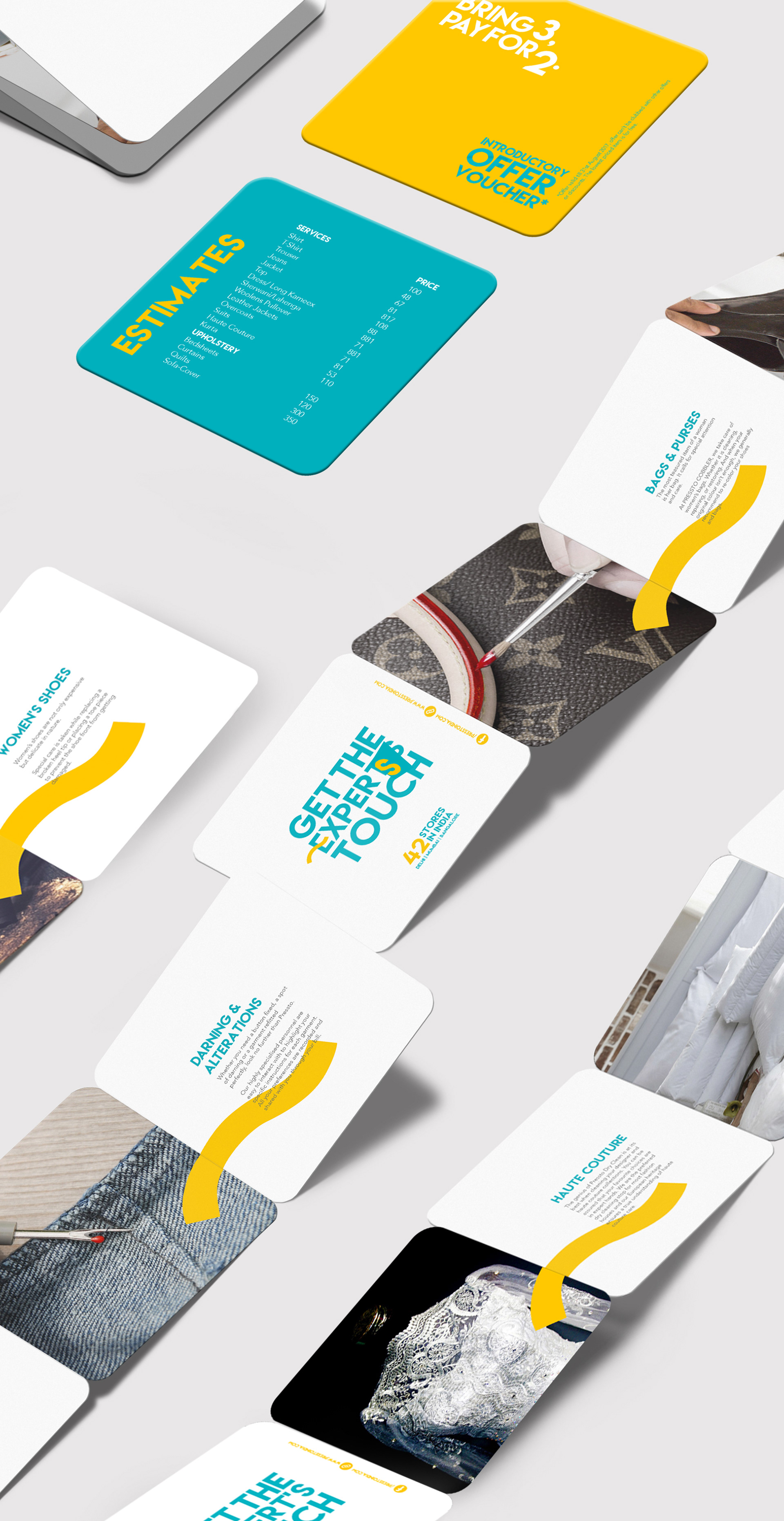
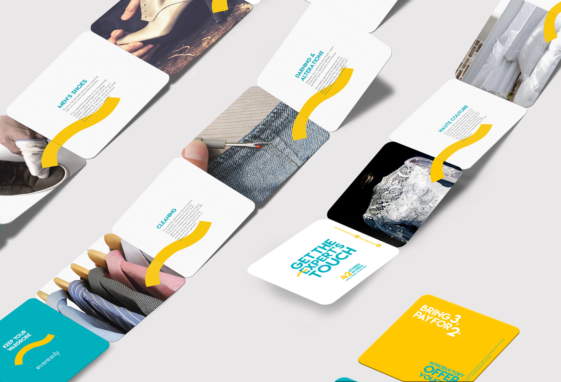
Service lists for Pressto cobbler and Pressto Dryclean.
Pocket size 4"x4" six panel accordion fold handouts .Insert- Introductory Vouchers and Estimate list.
LANGUAGE EXTENDED TO OTHER BRANDING ITEMS
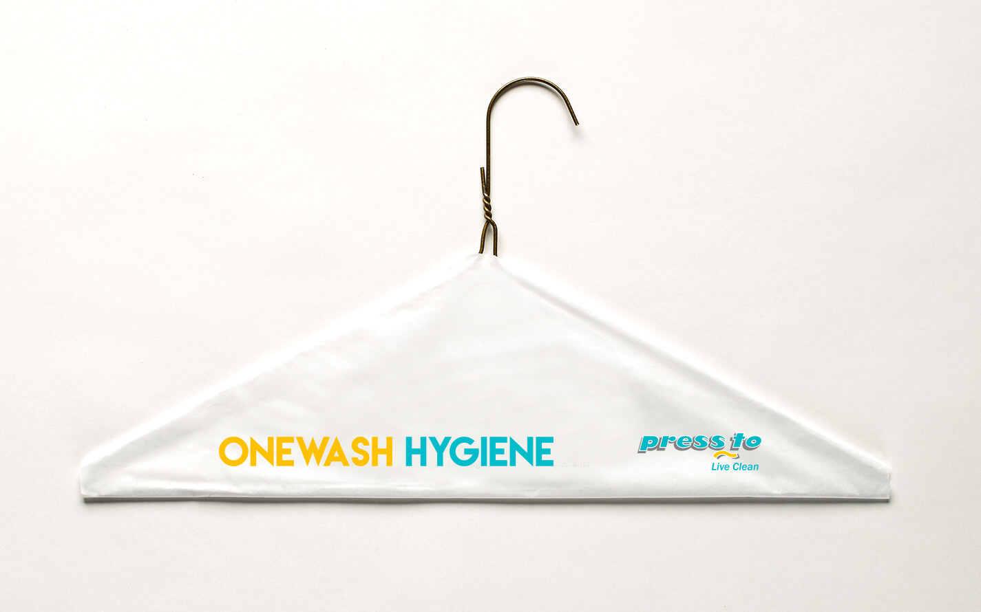
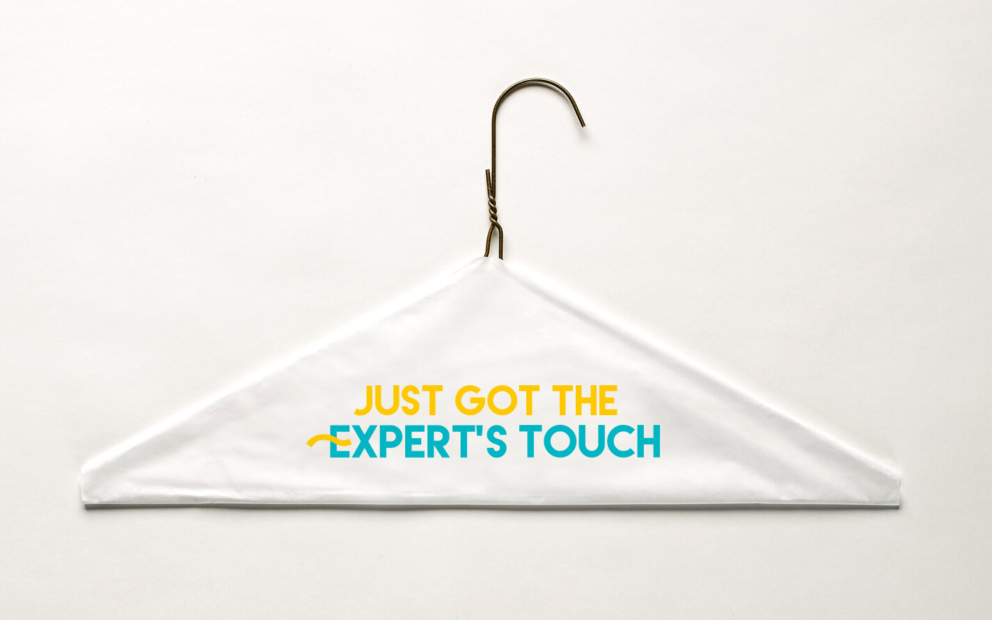
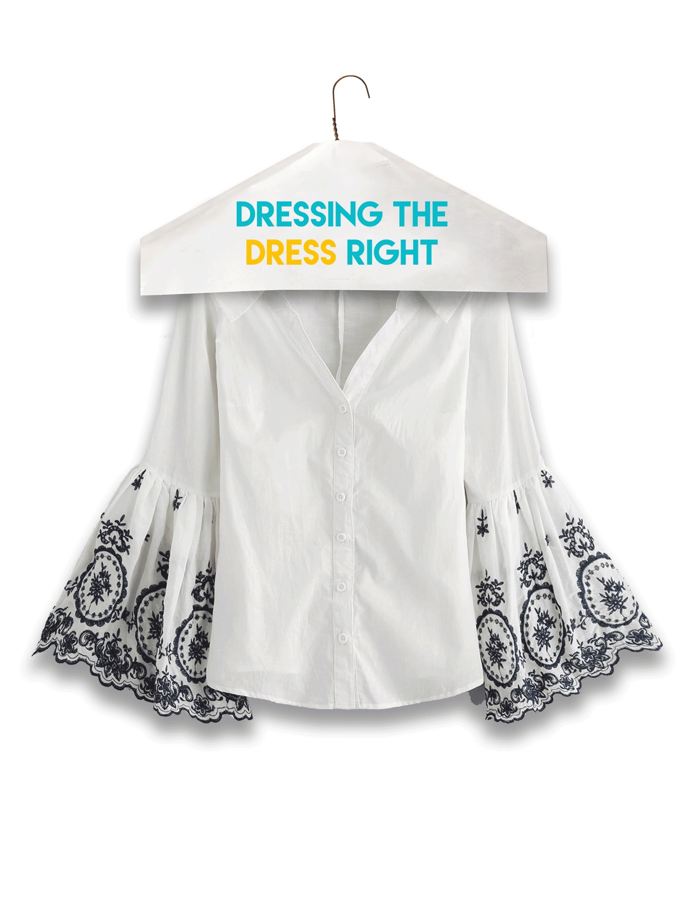
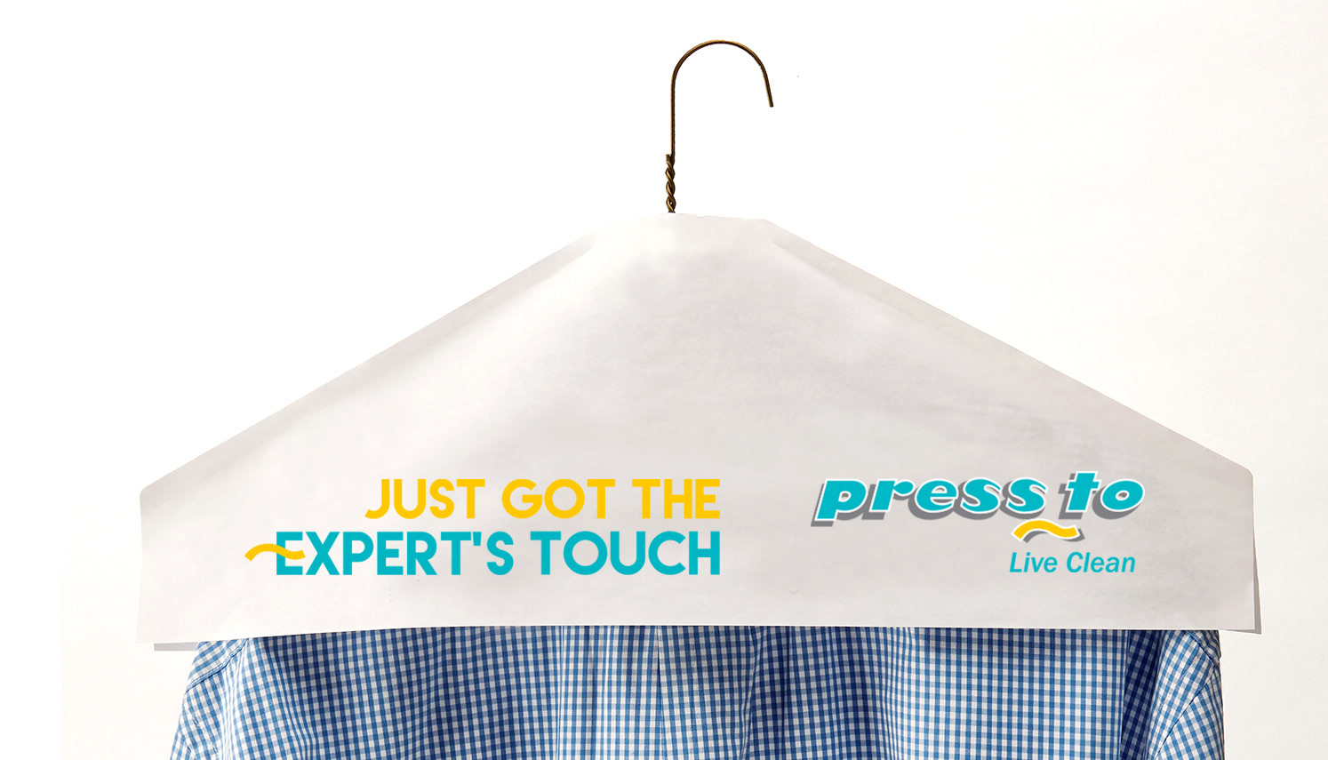
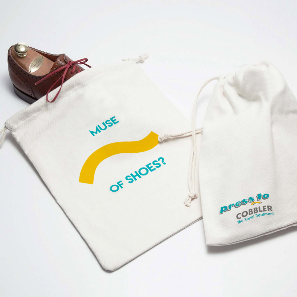
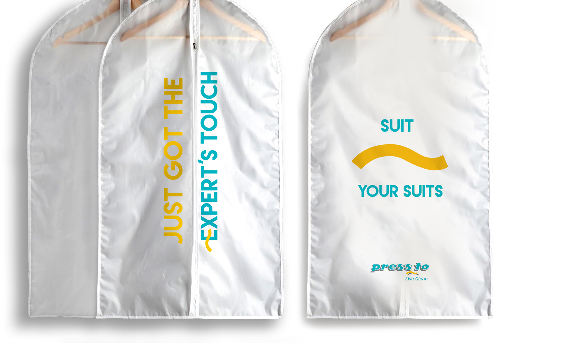
Relevant communication on relevant items on garment bags, shoe sleeves and delivery collaterals.
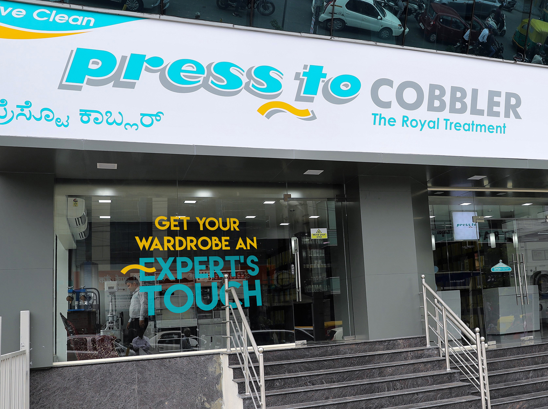
Store Facade Branding.
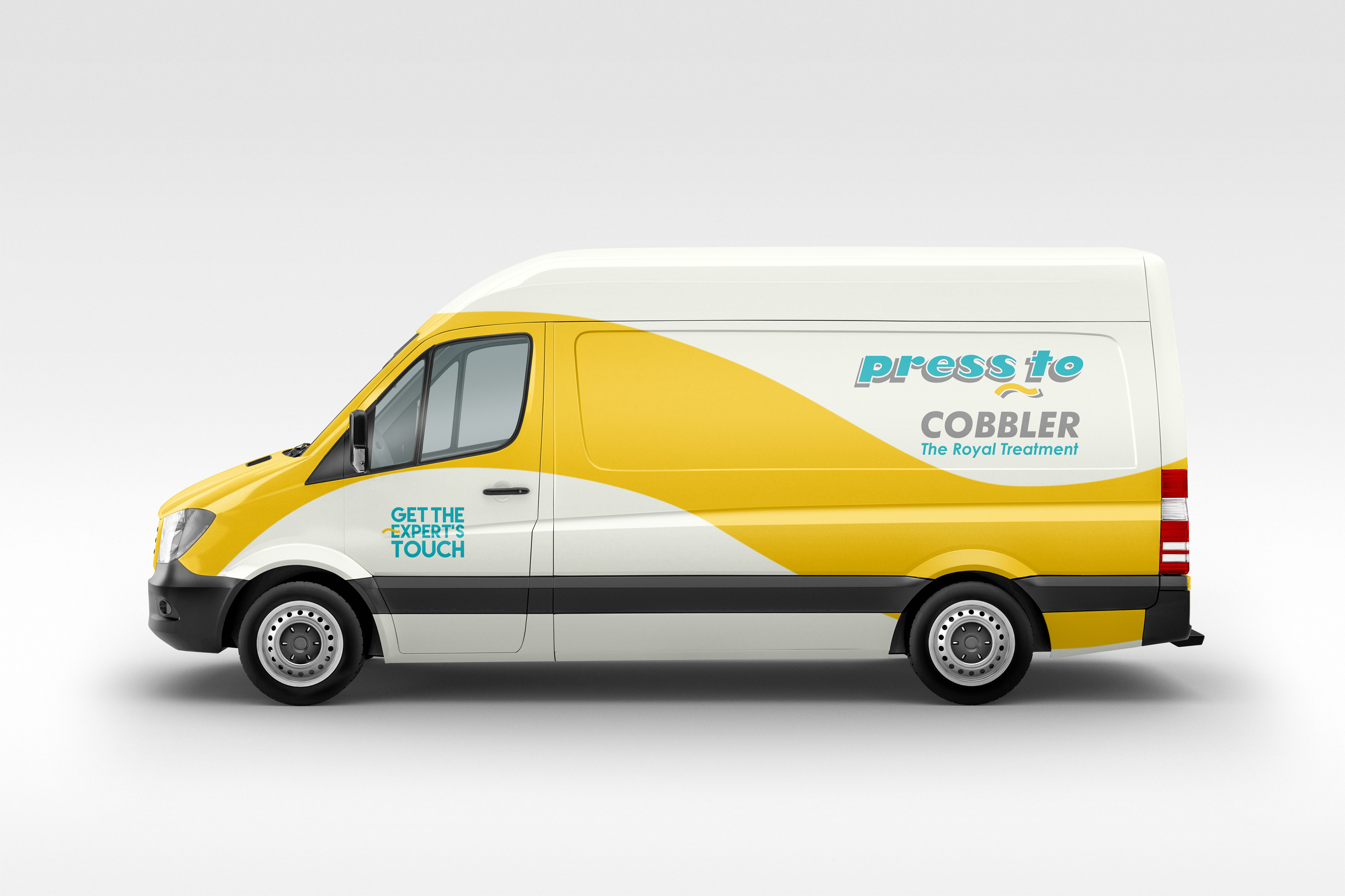
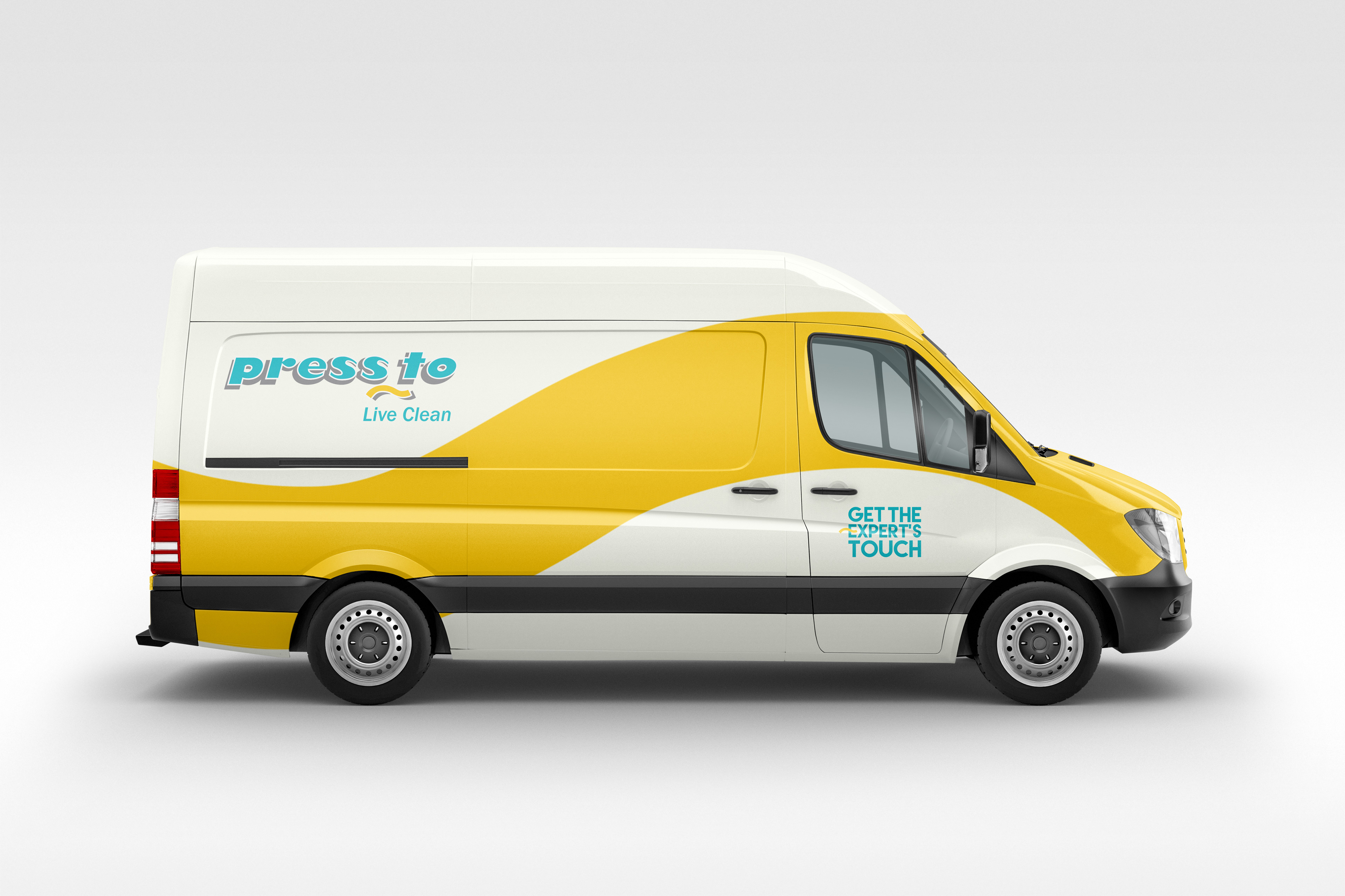
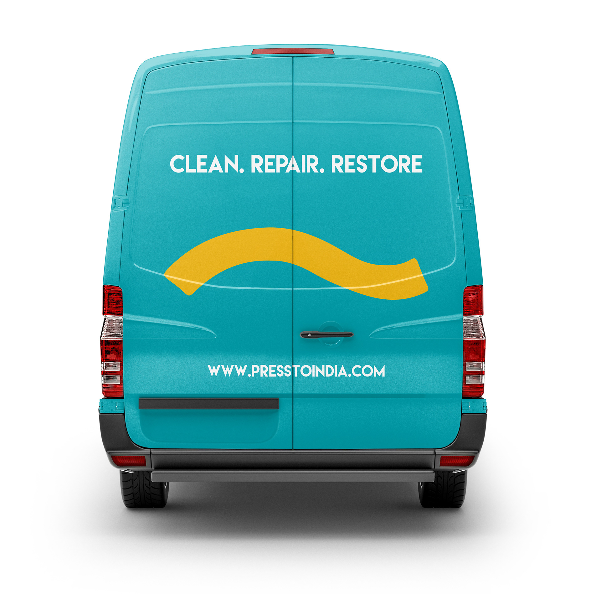
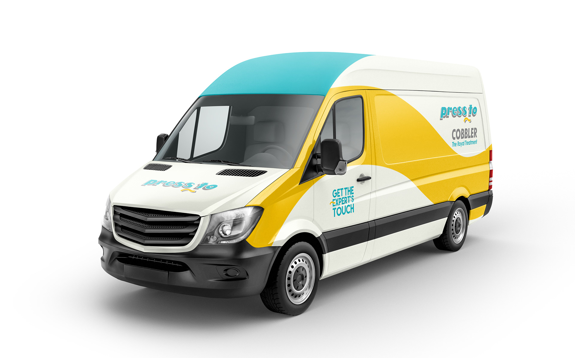
Delivery van livery designs.
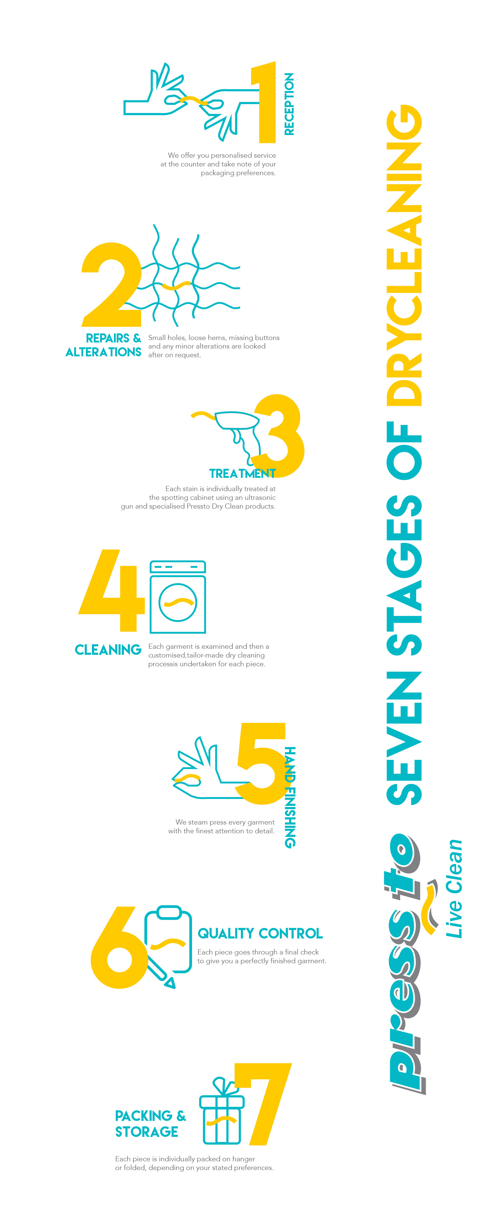
Infographics of the Pressto seven stage Dryclean process.
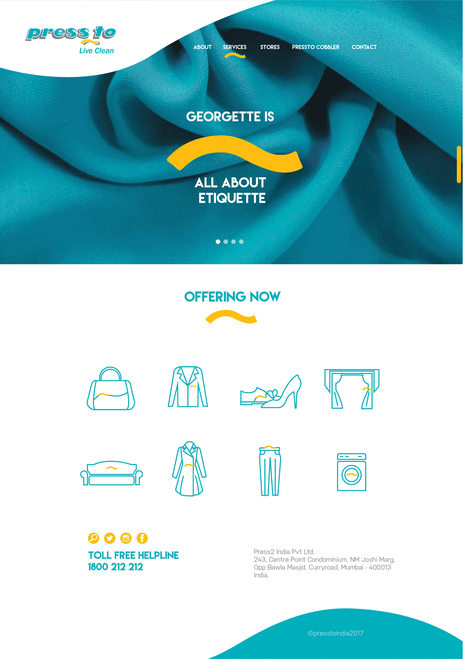
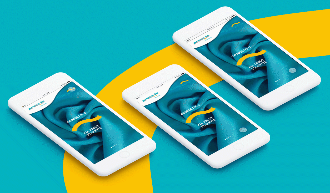
The Visual Communication strategy extended to Pressto India webpage and mobile user interface.
CAMPAIGN AND OFFER LED COMMUNICATIONS
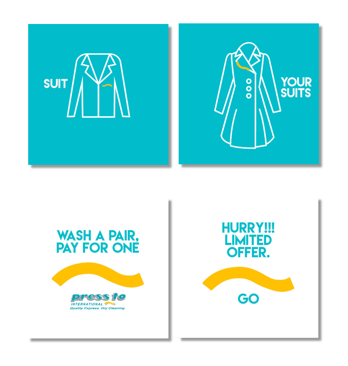
Site Banners for Promotional offers and Discounts.
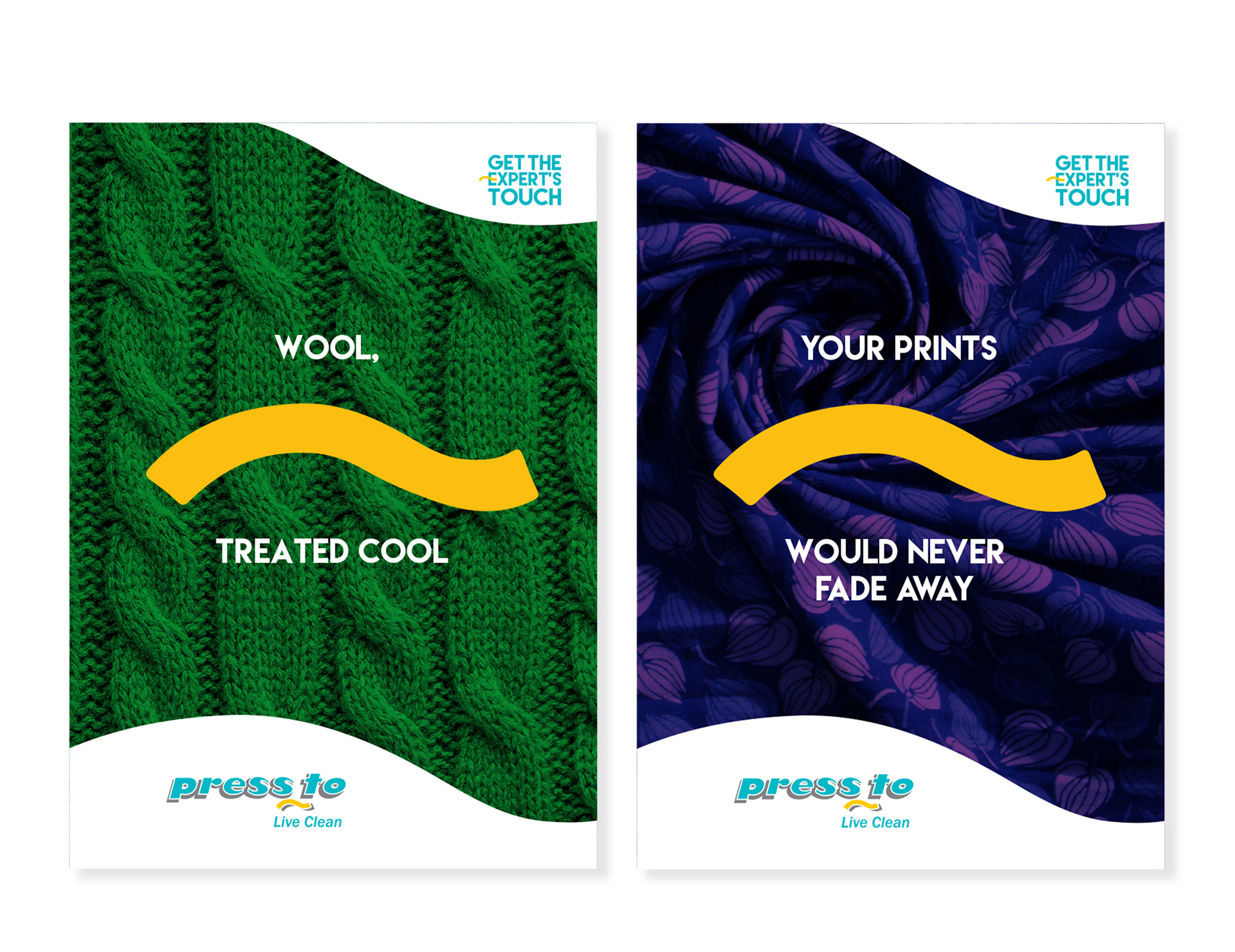

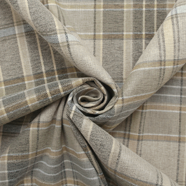
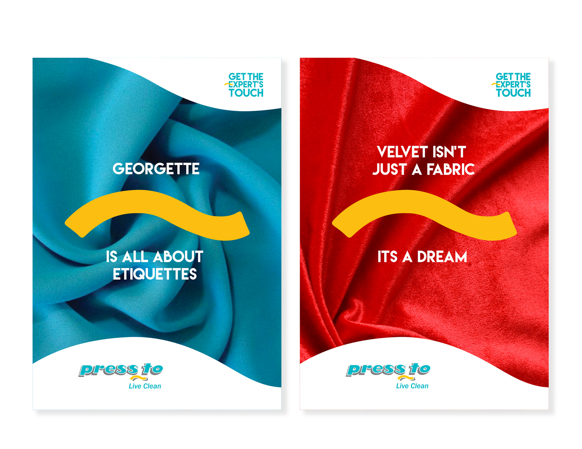
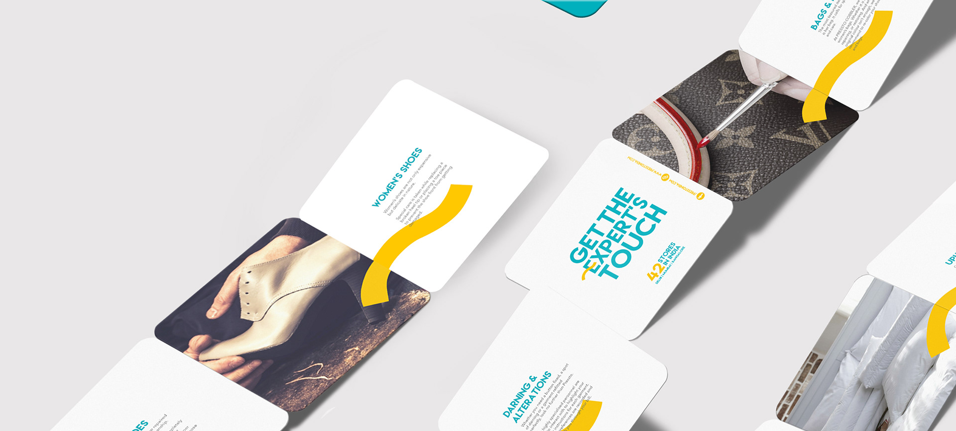
Communication Posters and interactive banners around the concept of Pressto's Expert Touch. Variety of textuxes of fabrics, leather, woollens were used to talk about the detail and precision of the Pressto's Drycleaning and Pressto Cobbler services.