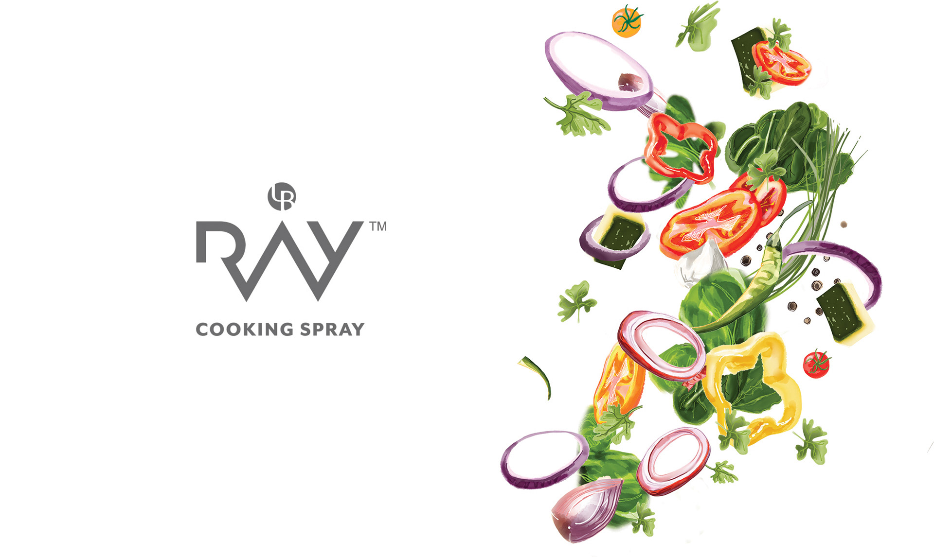
Ray Cooking Spray required a visual identity to be used across its communication platforms on its website as well as packaging and retail. The product promises to cut down regular fat content in your food to one- tenth and comes in an easy dispensing spray mechanism. Fresh theme for Ray Cooking Spray was developed, and was extended to a repackaging exercise, which made Ray Spray the healthier Oil Spray without any Propanol ( usually used in all oil sprays ) and makes you feel light and active.
MAKING RAY SPRAY - FEEL LIGHT
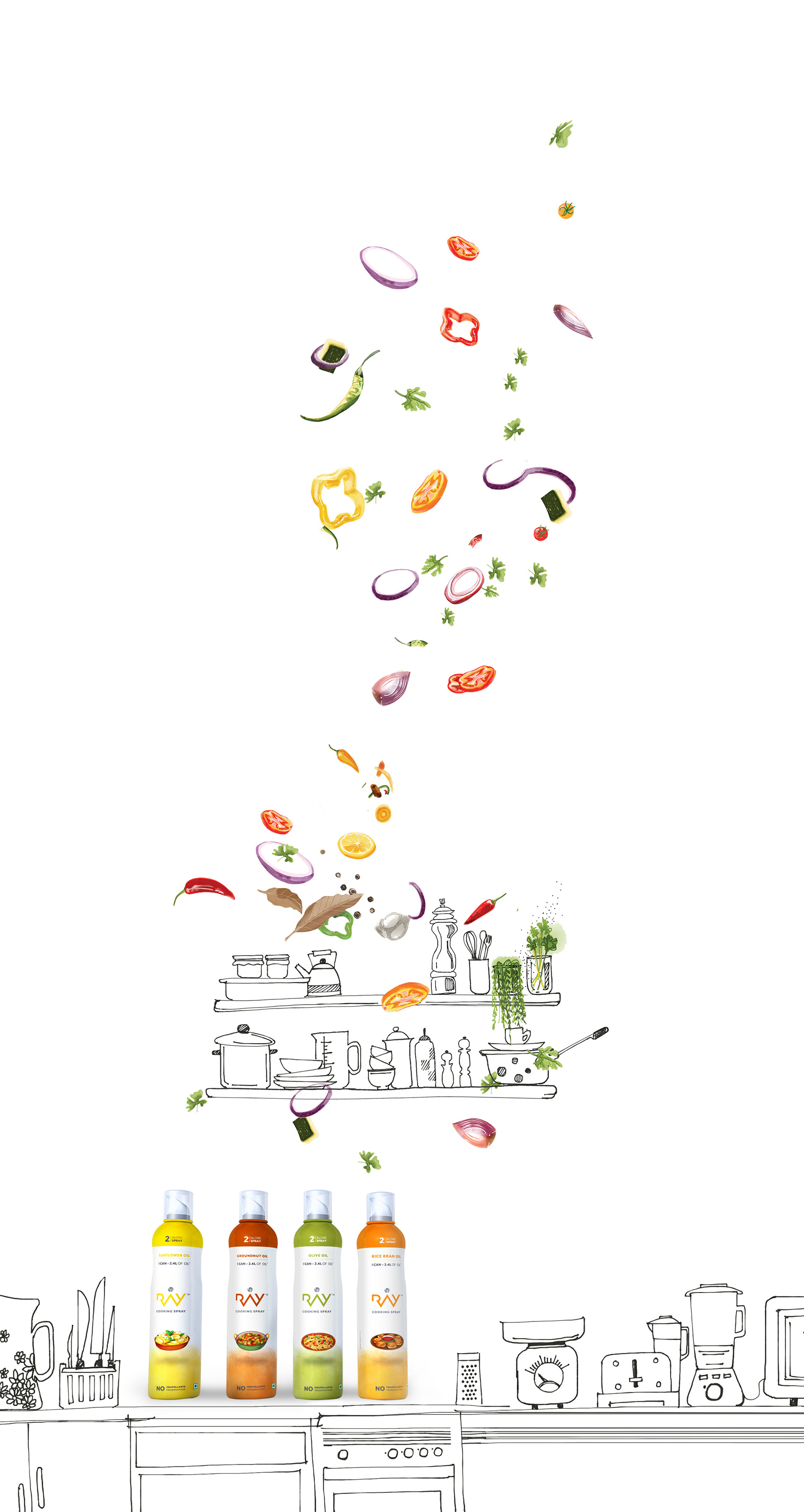
We started with an inspiration of showing food and cooking ingredients floating dreamily in the kitchen environment. Illustrations were developed with veggies and condiments floating in space, and later extended to revise the existing pack graphics and show levitated food shots- keeping the visual language simple and light.
MOTION
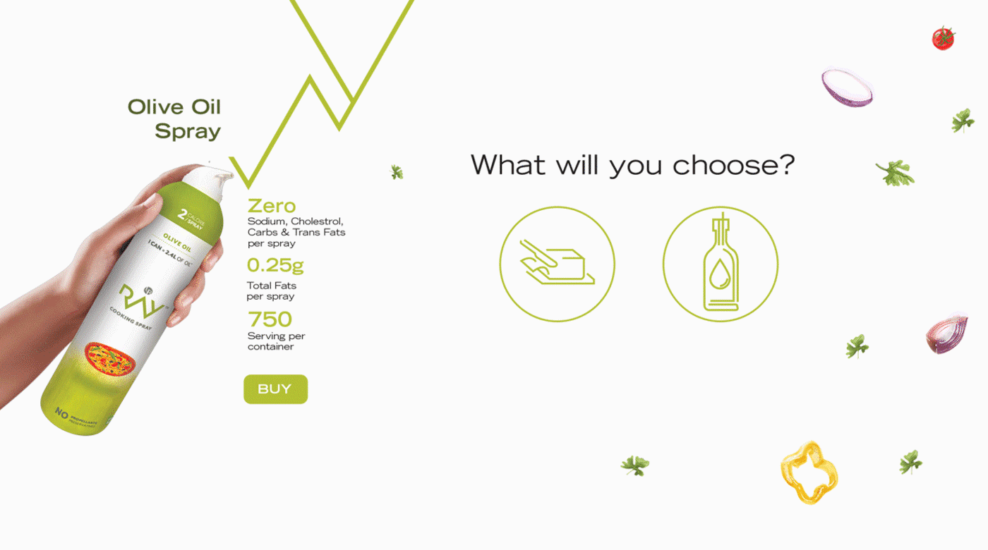
Sample Product Page with animated ingredients wiggling indefinitely in space. Use of infographics helps customers for easy product differentiation.
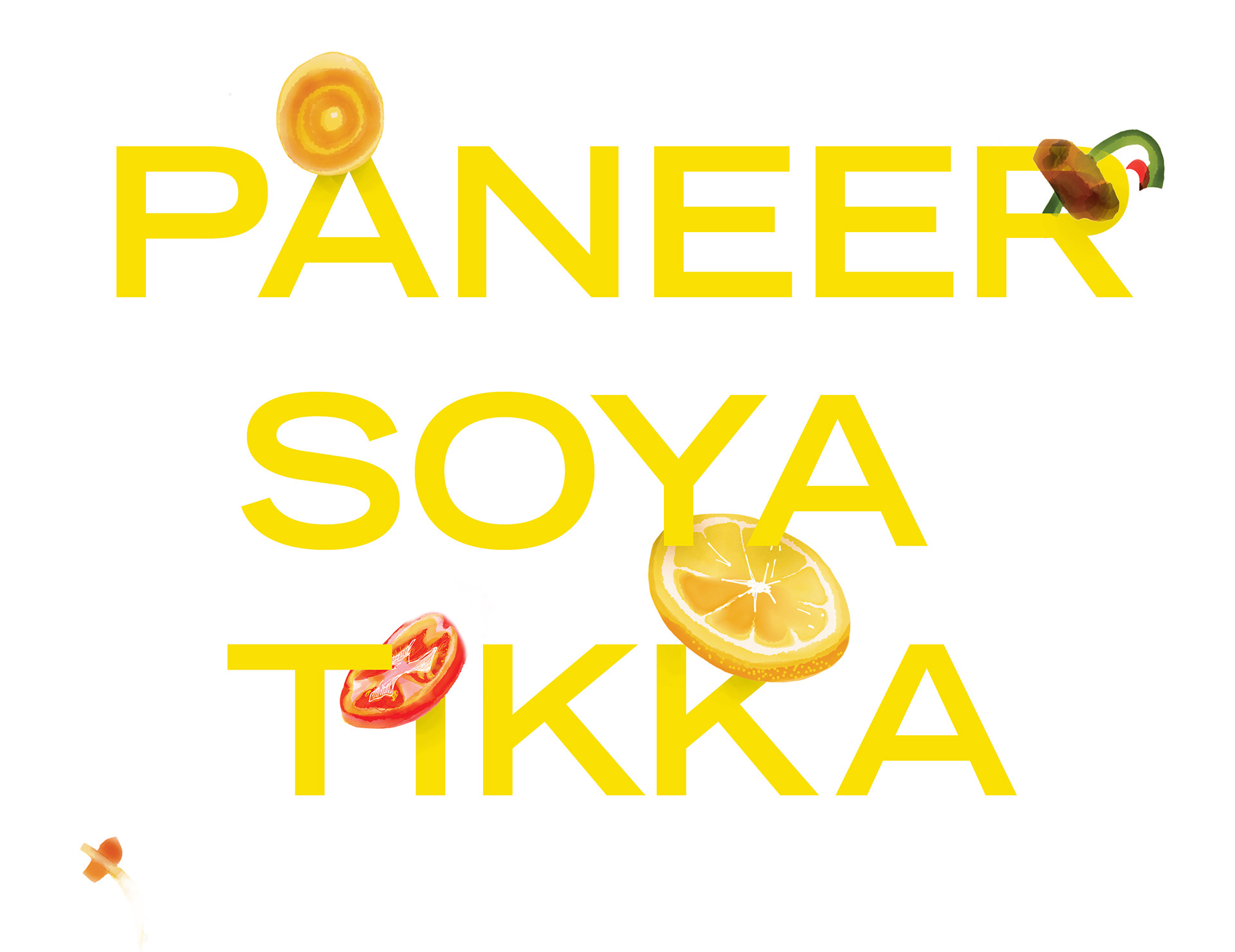
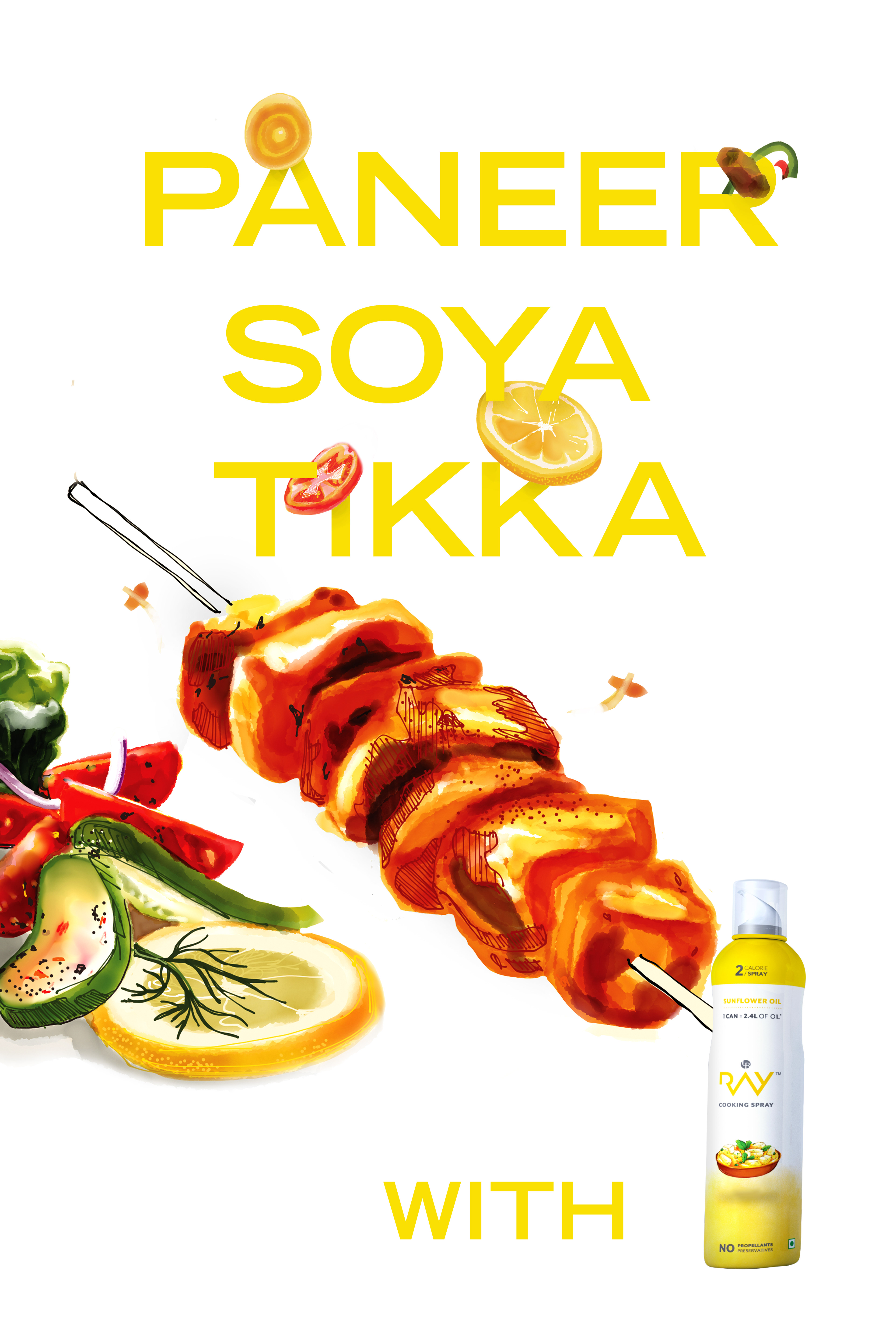
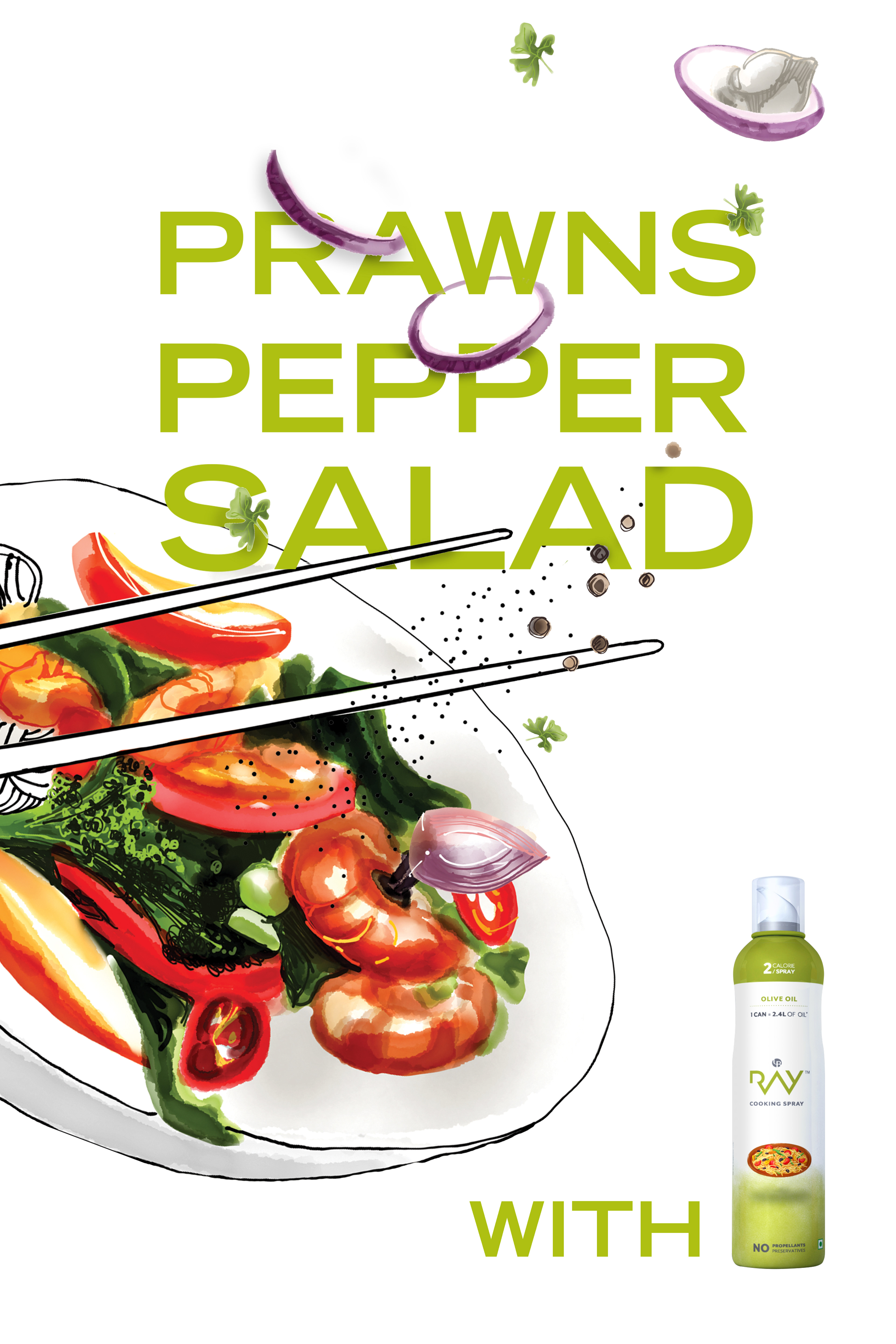
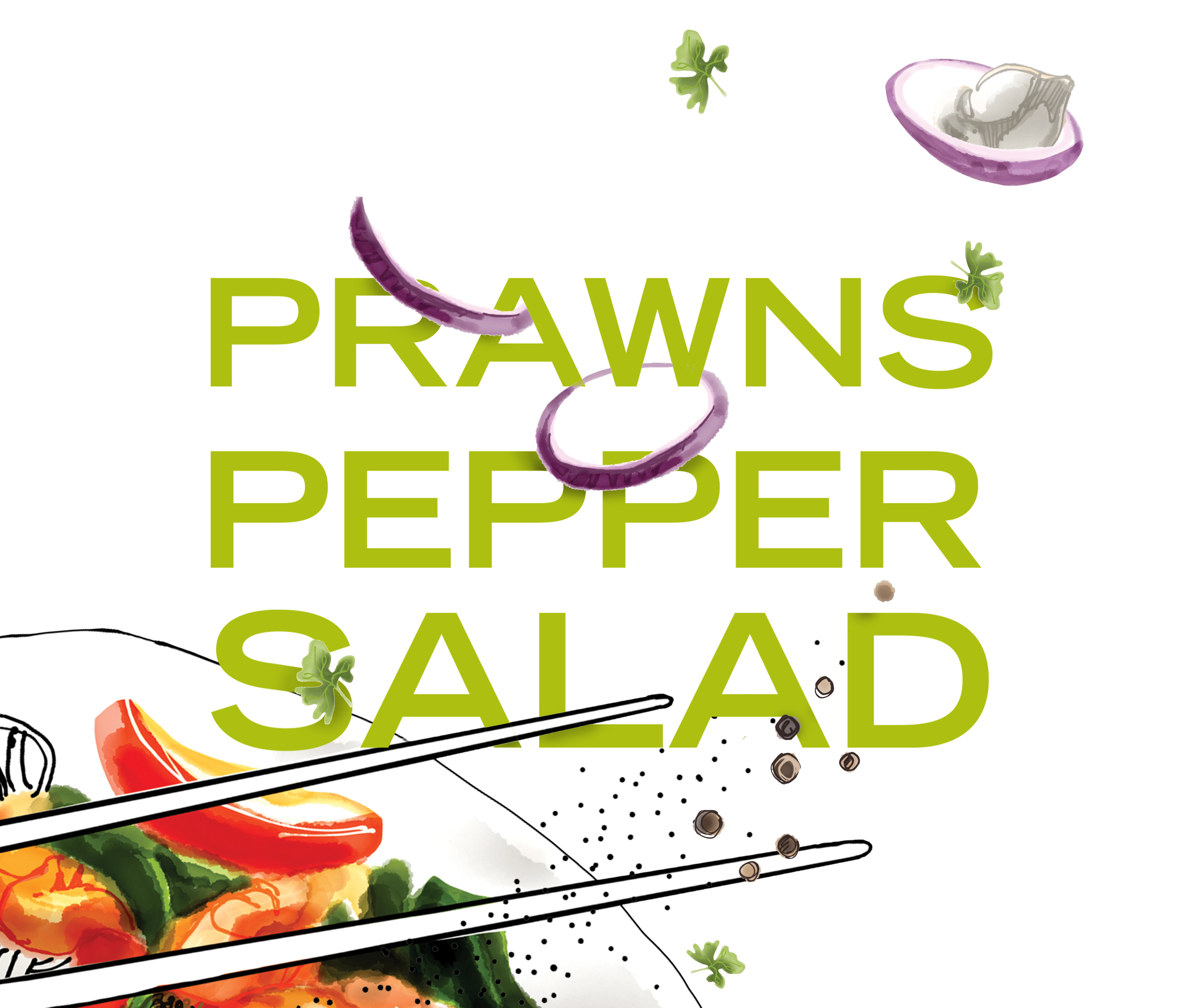
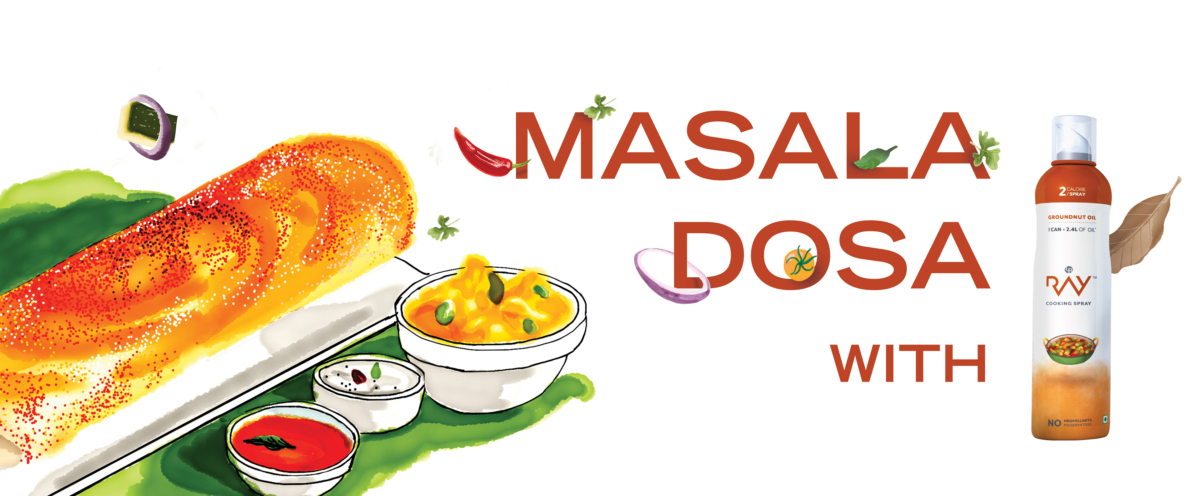
Various Food shots illustrations, showing them levitated in space, keeping it light. The Typography of food names interacts with ingredients afloat.
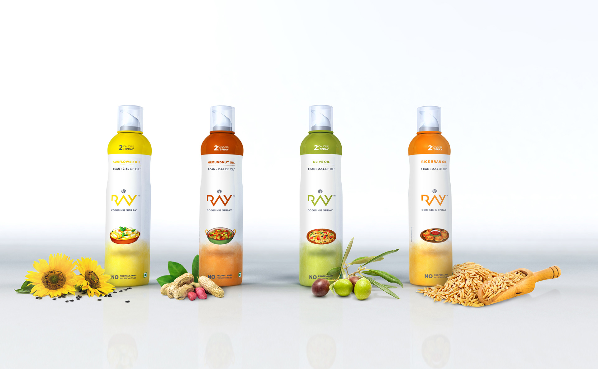
The concept was used to redesign the pack available in four variants - Sunflower, Groundnut, Olive Oil, Rice Bran Oil.
Credits
3D Packshots - Anket Pagare
Graphic Designer - Priyanka Barcha Shroff