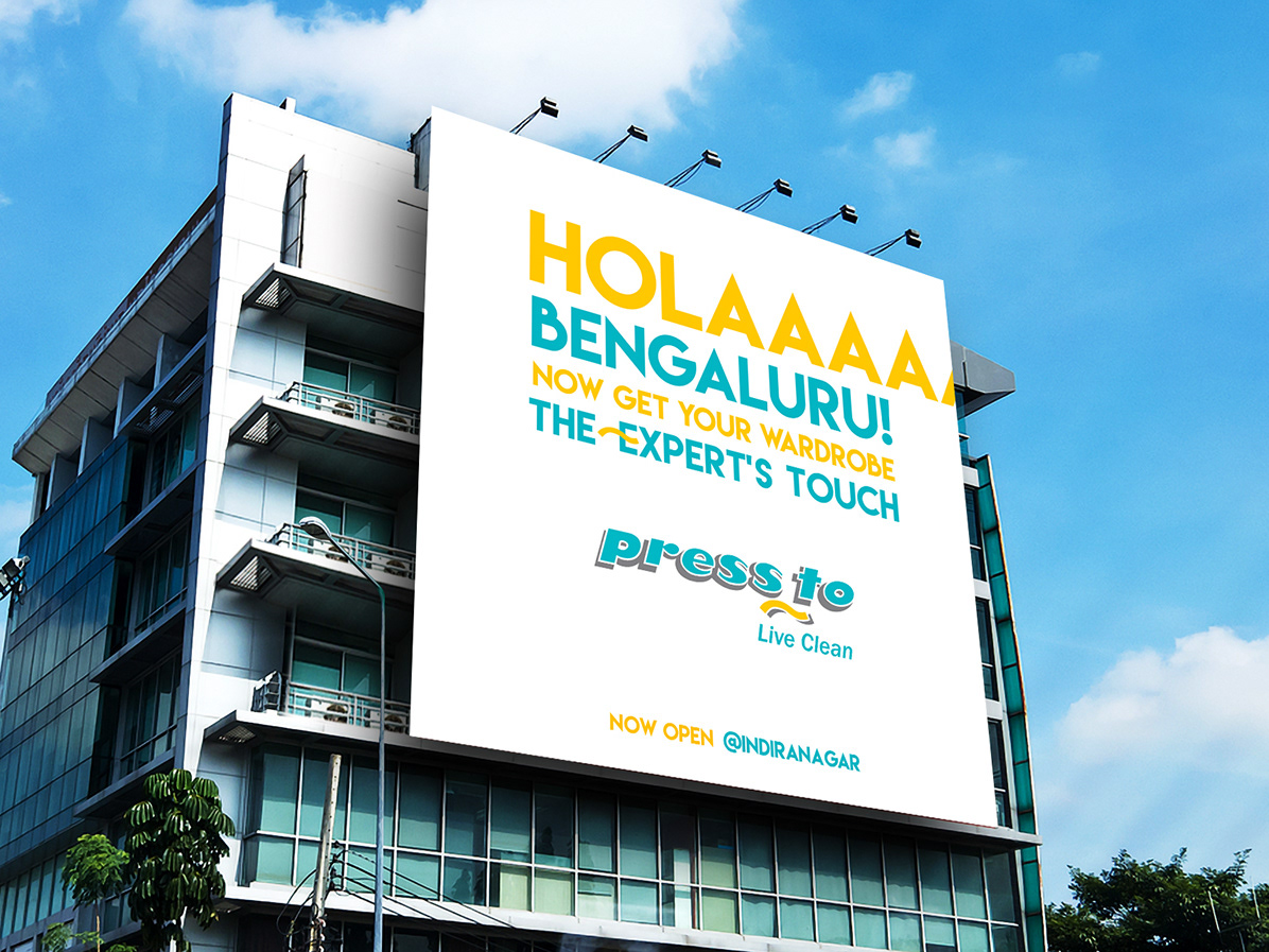
PROJECT OVERVIEW
Hero Cylces, one of the worlds leading Bicycle manufacturers producing 19000 cycles per day, and with presence over 70 countries is a global Cycle brand for more 50 years. As a part of its recent acquisition with UK based Avocet Sports Limited, Hero was gearing for its launch of retail stores- that offer the widest variety of bike range and anything and everything related to cycling, to mark its entry into the high-value cycle market in Indian metros and tier two cities.
THE BRIEF
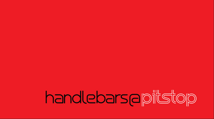
Develop a Branding Identity System for Hero - Pitstop, a retail chain offering anything and everything of cycling all at one stop destination for cyclists. The brand is not just limited to a retail store and extends to on ground cycling events, cyclist meets and community platforms.
THE INSPIRATION
Adventure, journey and explorations all co exist with a sense of motion, a forward movement as we ride our bikes. The mutual relations between the roads, tracks and trails and the rolling wheels that takes us to places unknown. Its the sense of motion, continuity, and movement that establishes the pause.
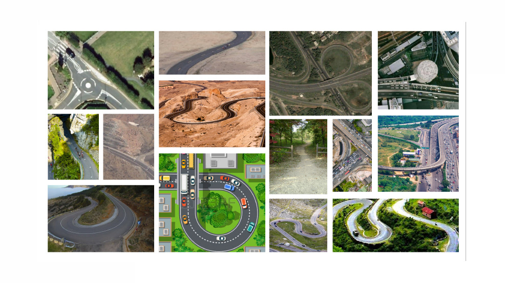
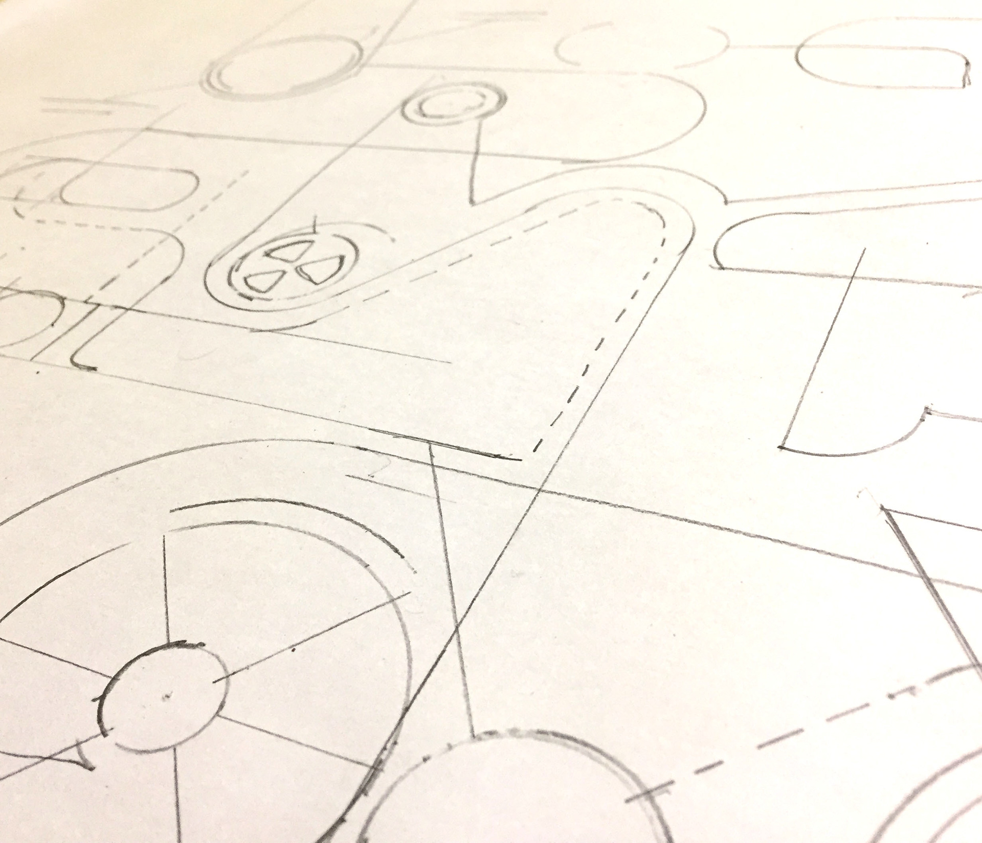
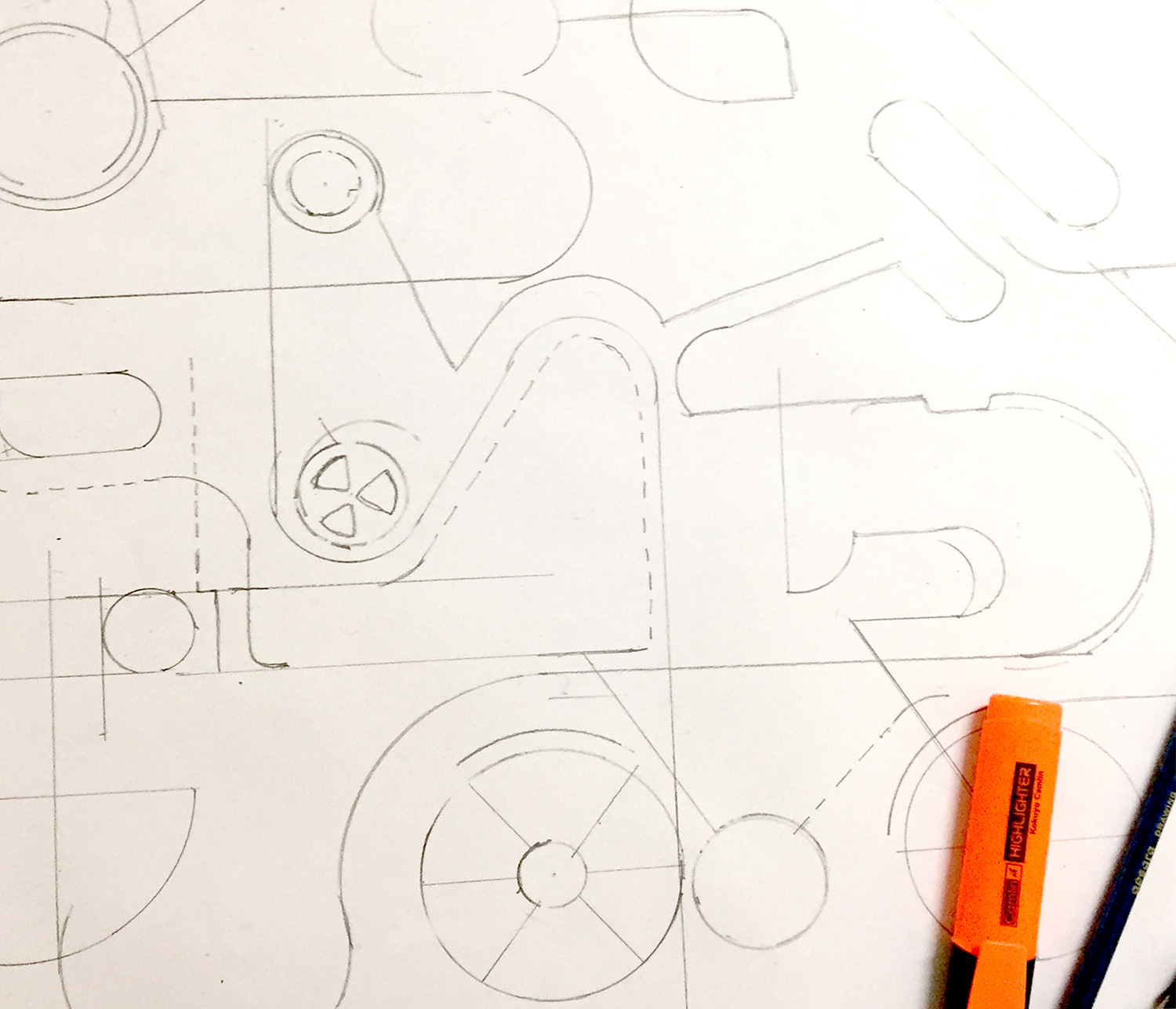
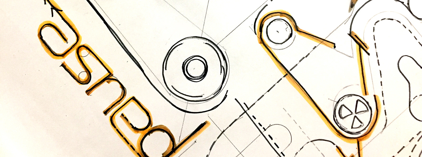
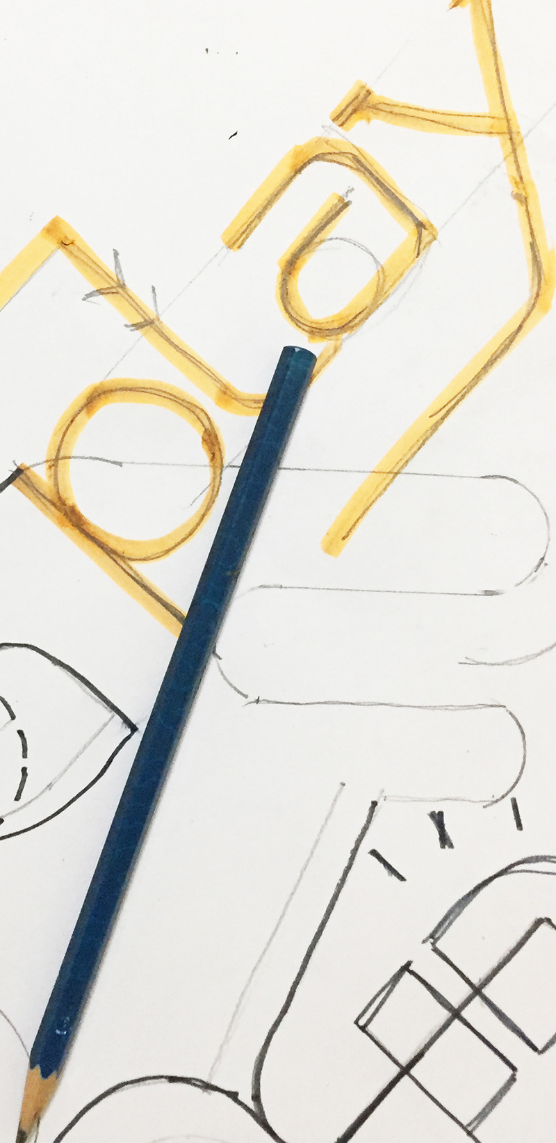
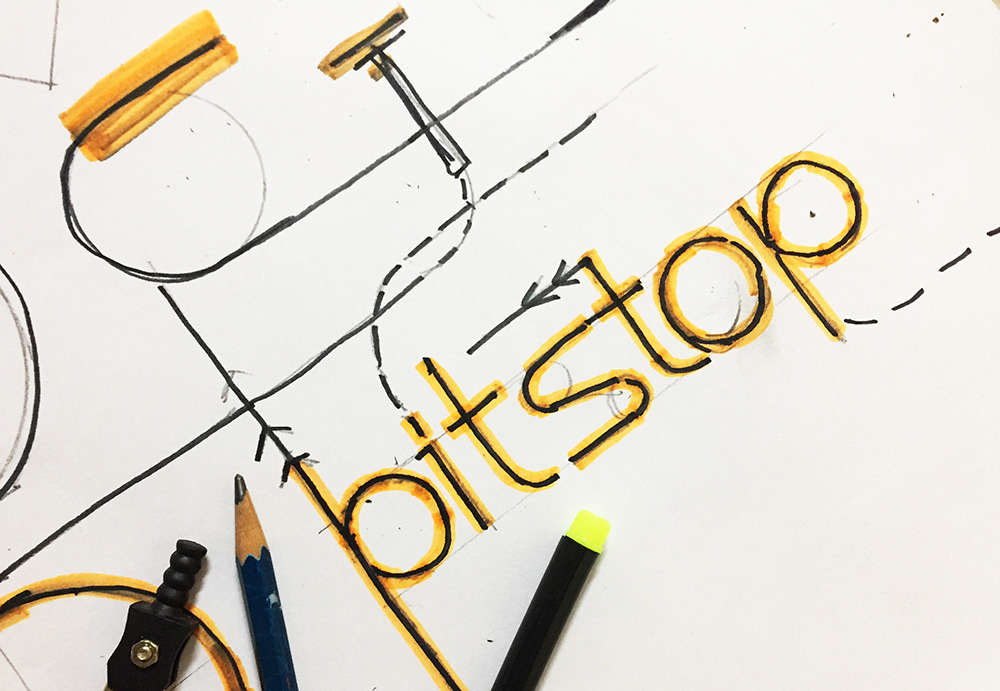
Sketches and initial mood boards in the process of development of the visual language for pitstop.
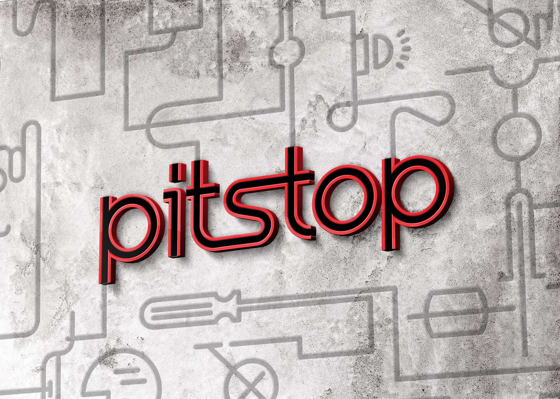
The logo evolves from the intersections of the moving lines, the crossroads of journeys.

The logo- Form
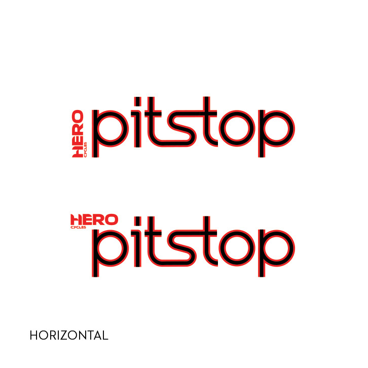
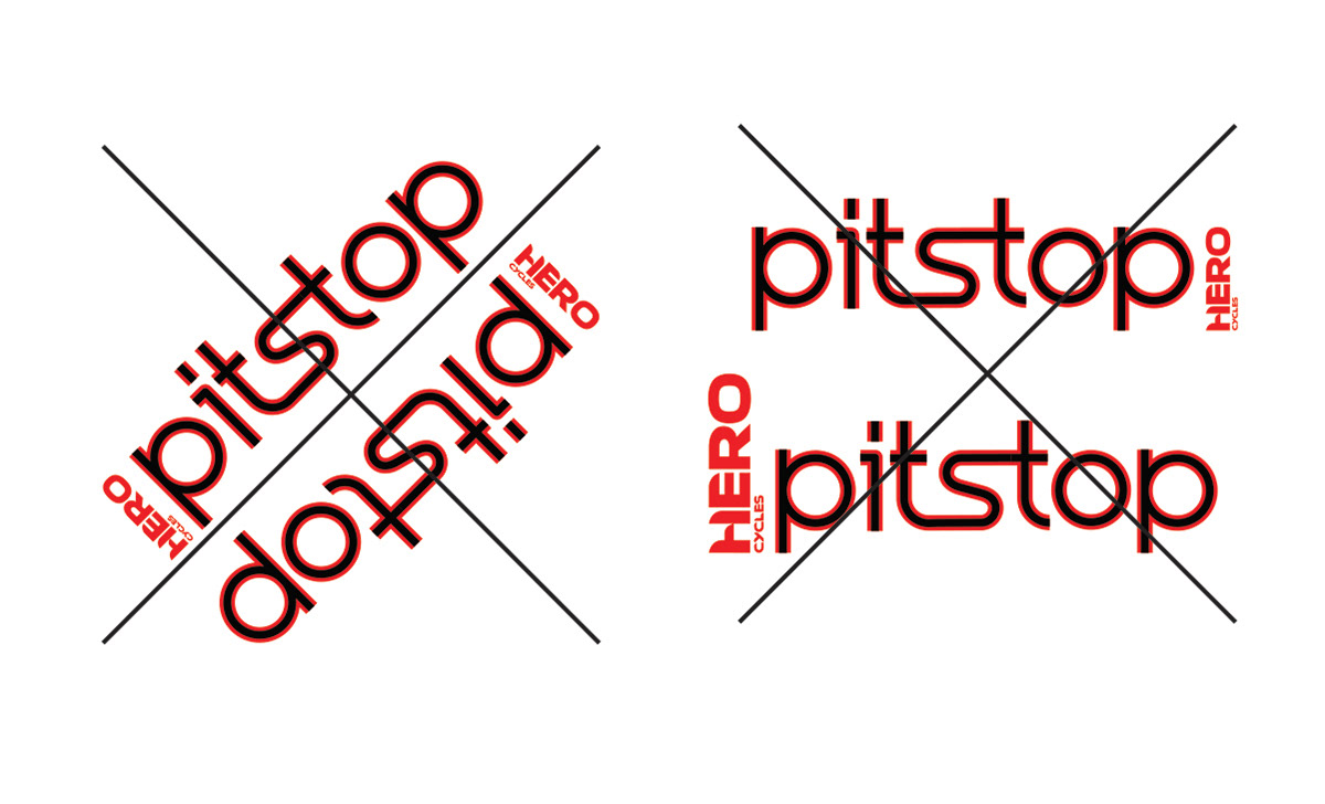
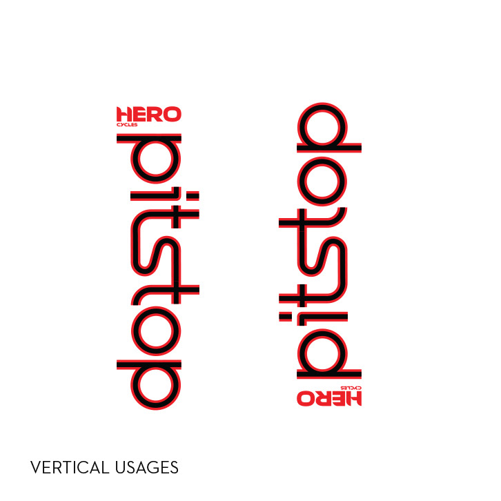
Logo Usage Guidelines.
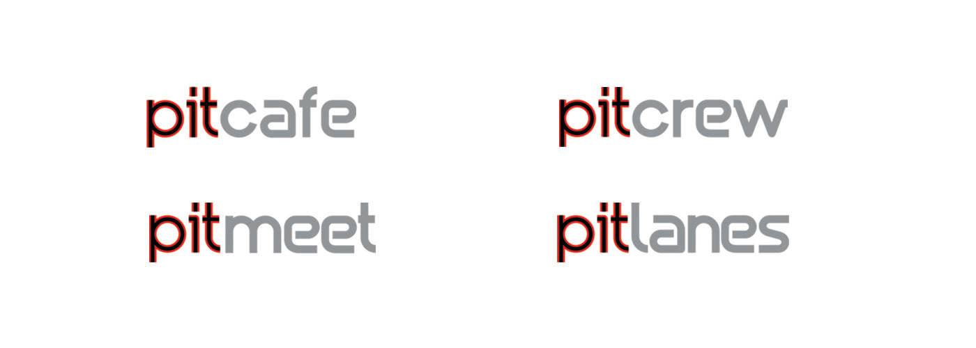
Secondary Brand Logos
BRAND LANGUAGE
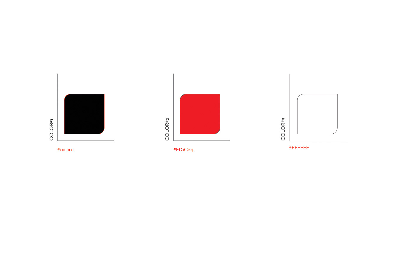
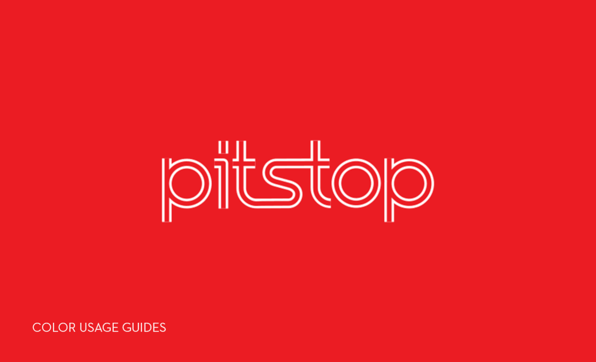
COLOURS- The colours are primarily derived from the Hero Brand logo. The three palettes can be used at variable proportions to add to the dynamism for motion branding purposes.
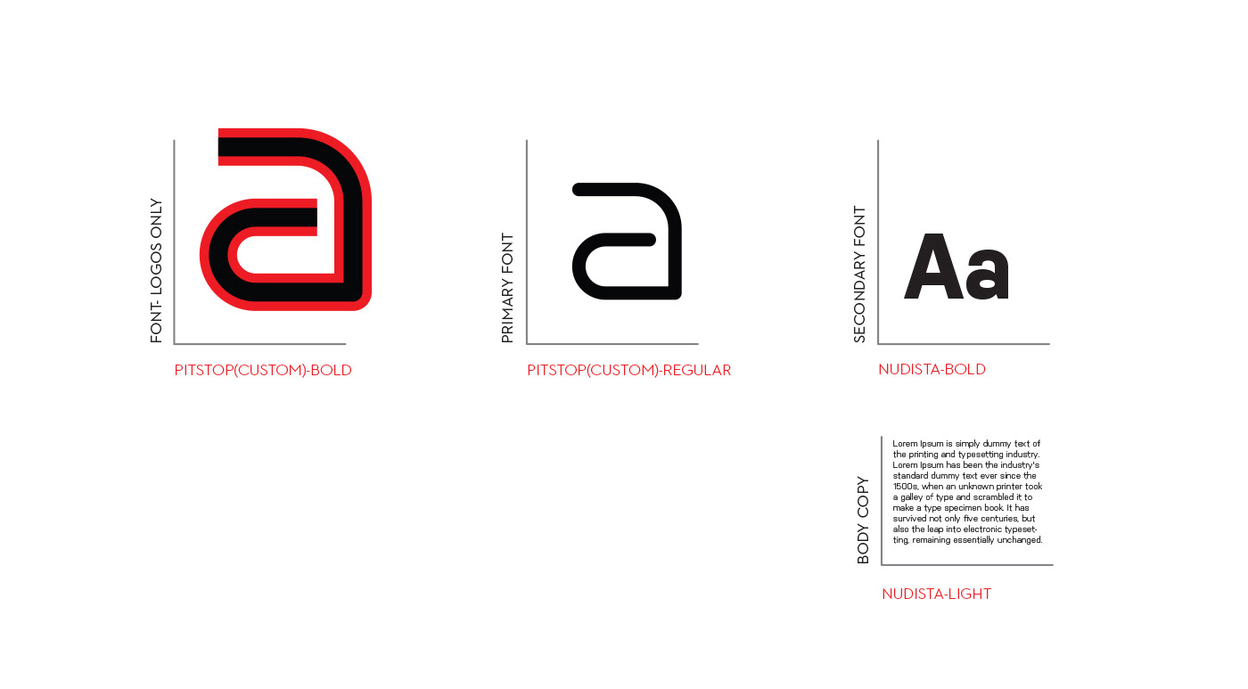
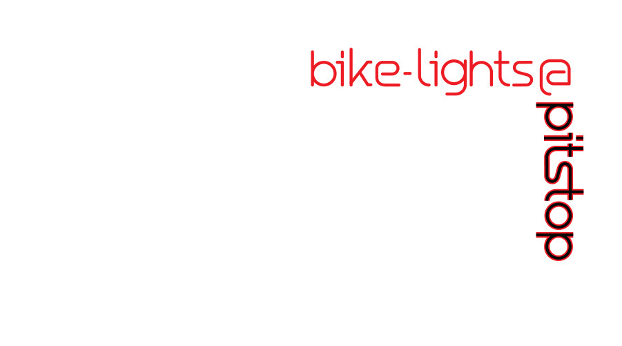
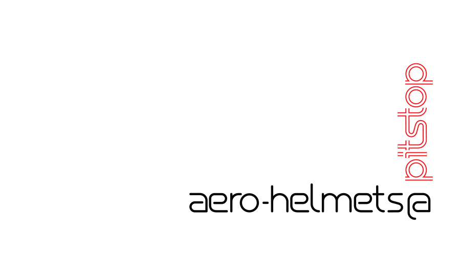
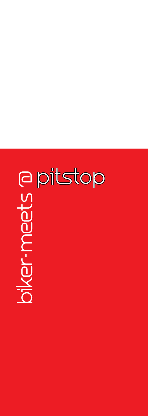
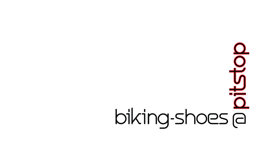
TYPOGRAPHY- The A set of custom design font family is developed that reinforces branding in text and
various communications. The Pitstop font family appears in lower case only, with variations of Bold and Lightweight fonts.
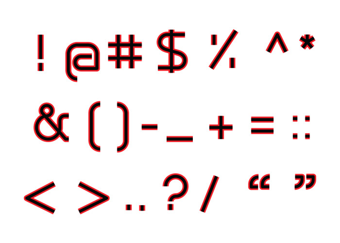
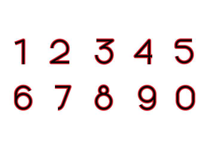
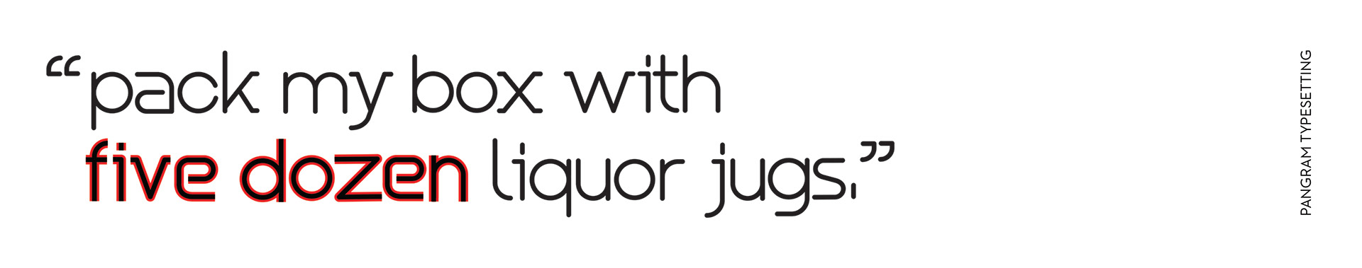
CUSTOM FONT- PITSTOP
The font family is inspired from the concept of moving roads and intersections,
to be used for exclusive Pitstop branding.
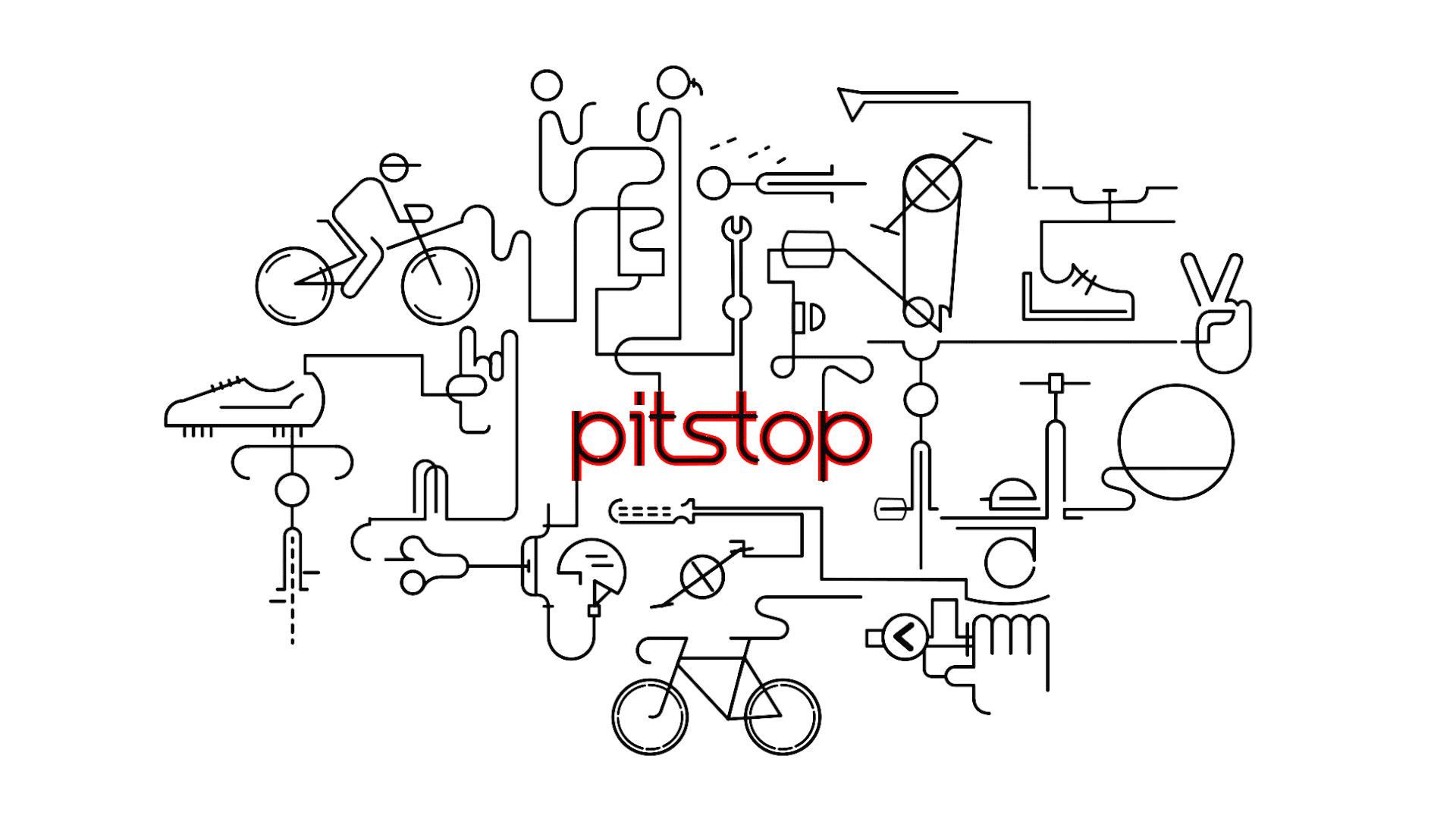
ADDING MOTION TO PITSTOP
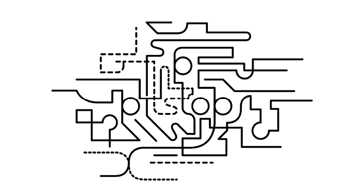
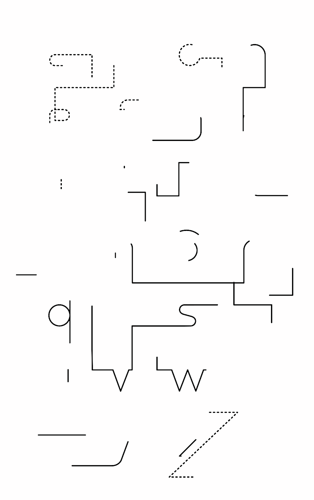
The secondary brand language extends to add motion to the brand, which is continuous and looped, all converging to, and originating from, the brand logo.
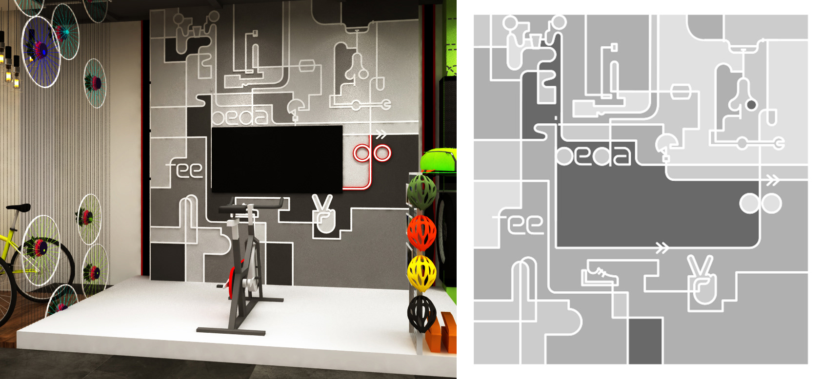
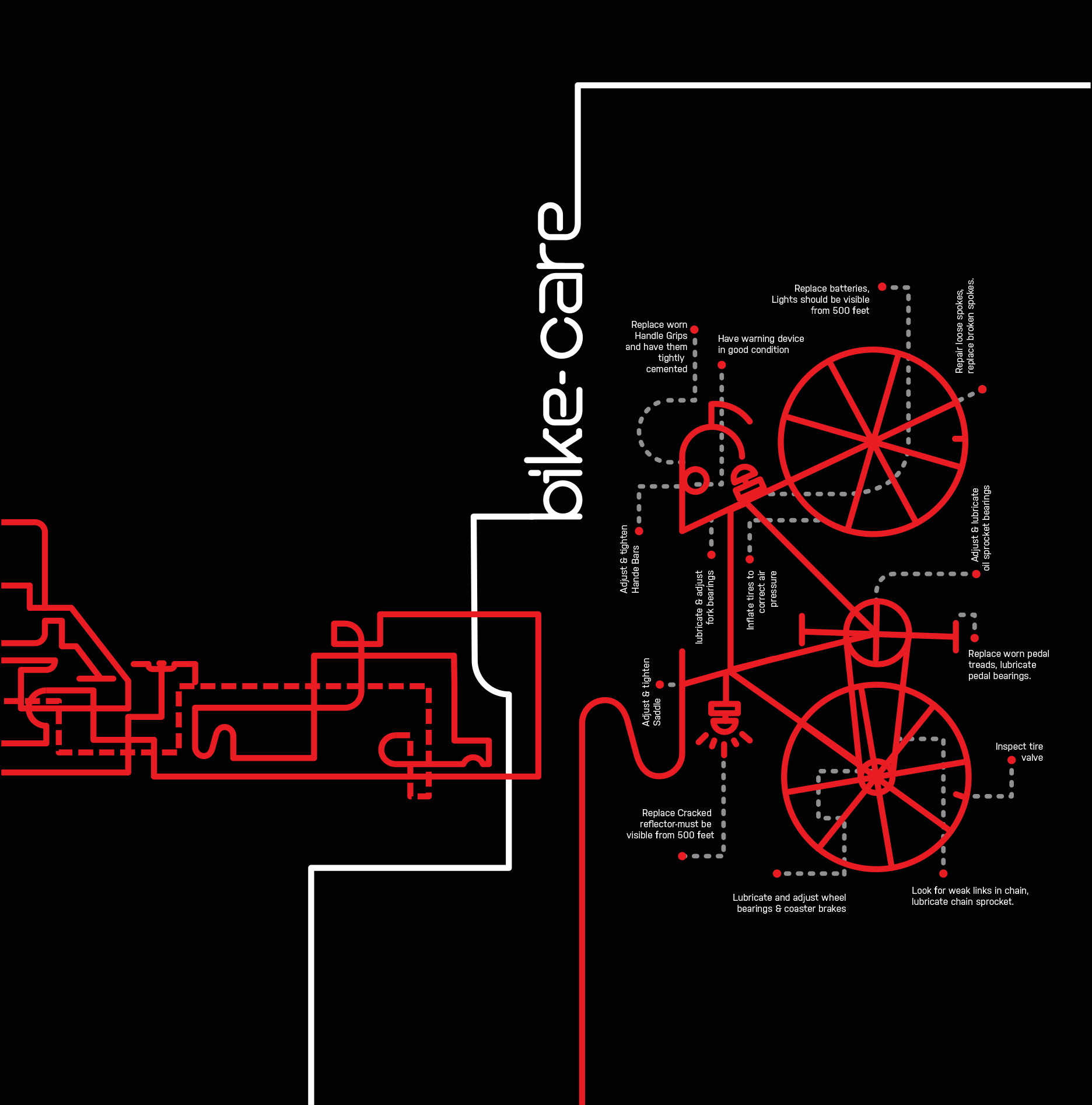
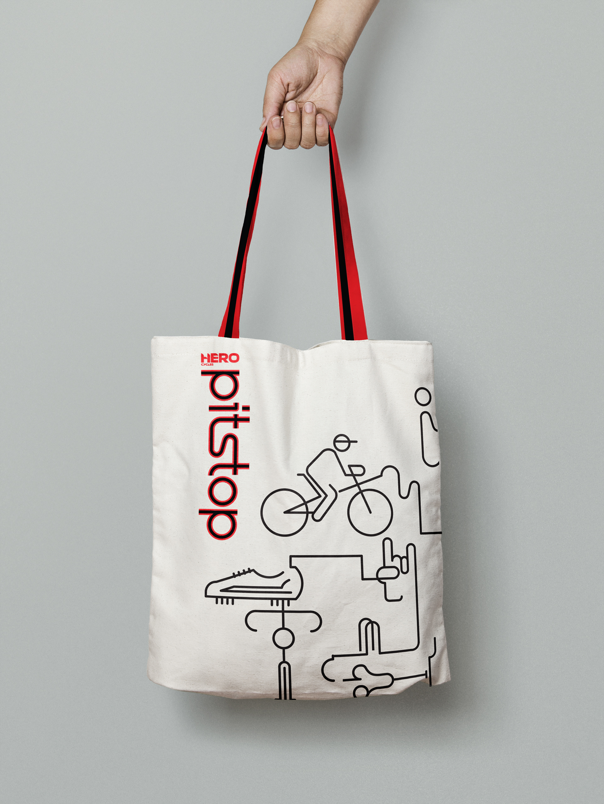
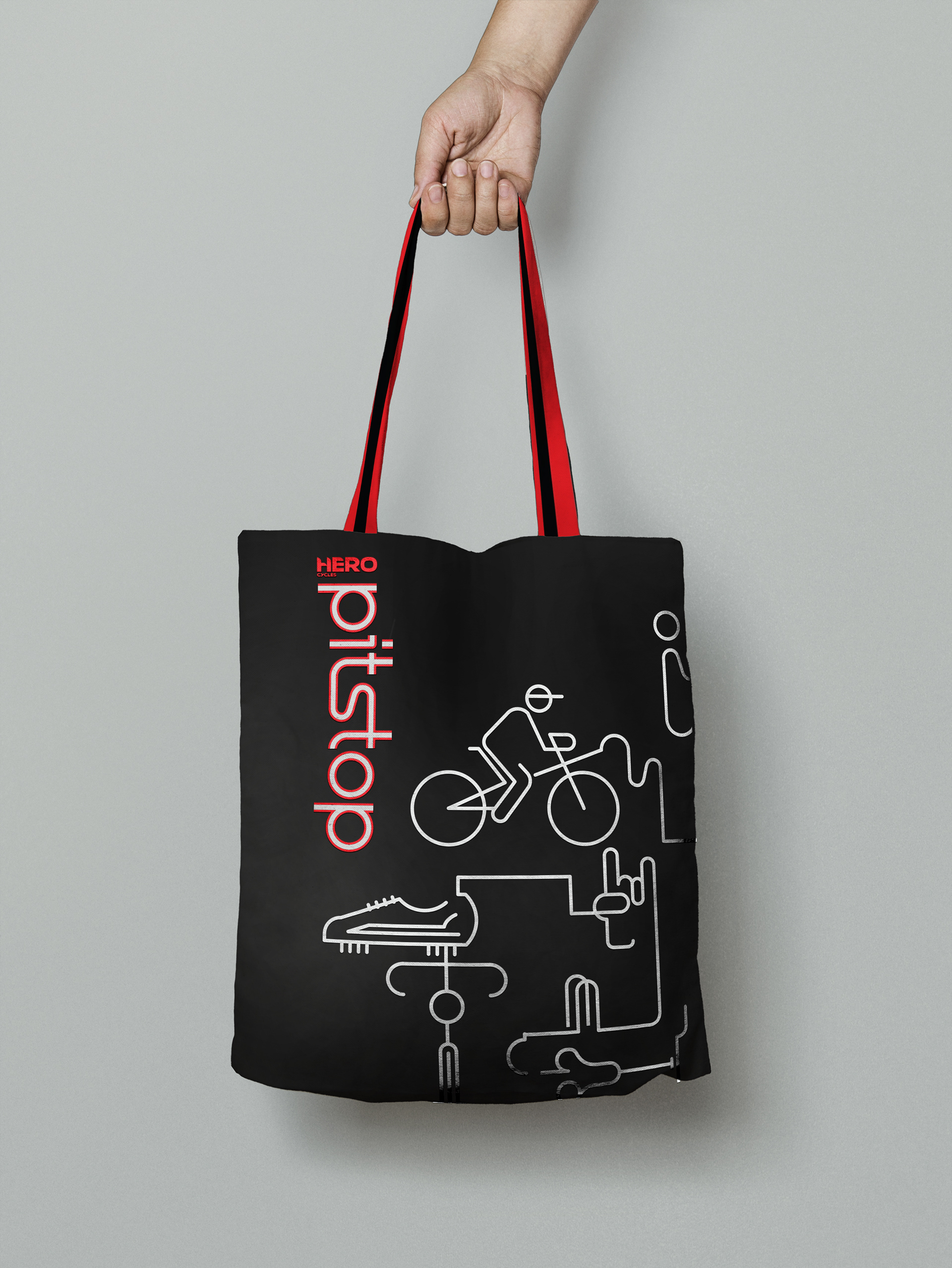
The motion of dotted and solid lines of fixed weights ( as per proportions ) creates illusions of moving lines morphing into bicycles, accessories, bike parts and brand features.


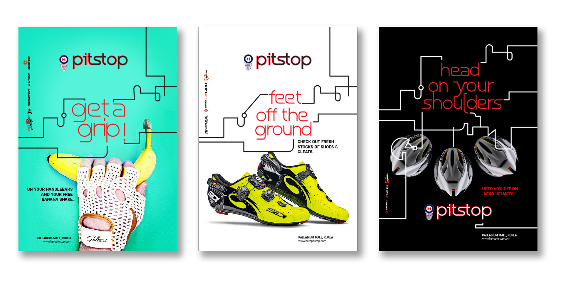
Product Offers Layouts
COLOR CODING PITSTOP
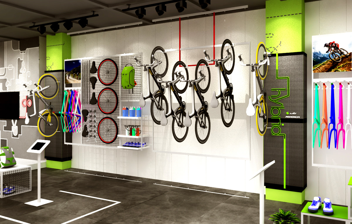
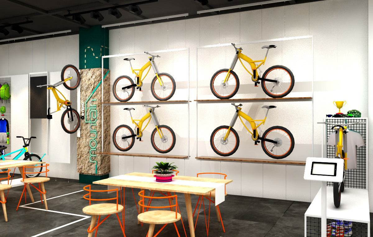
Pitstop promises to offer its customers the widest range of bicycles - mountain, hybrid, urban, kids and custom bikes. Various range of bicycles were colour coded as per category, adding hierarchy by colour to the brand, making it easier for shoppers to navigate within the retail space both online as well as offline.


The animations can be rendered as .svg animations for best results with extremely low file size, making it crisp in appearance and in motion. Here's an example with basic html, thanks to Bodymovin and Kittons from codepen to come up with this amazing plugin.
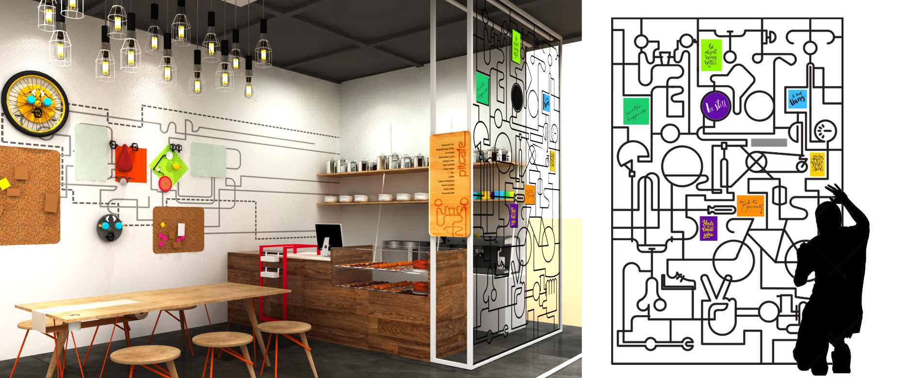
EXTENDING BRAND LANGUAGE TO RETAIL
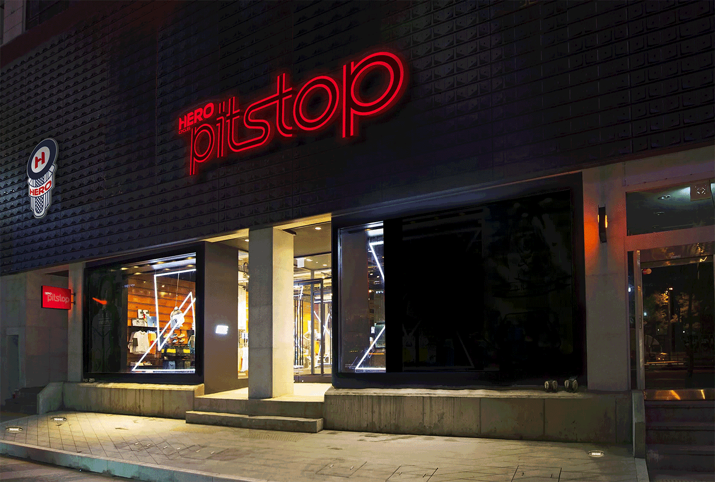
Interactive Display at shop facade, that responds to passerby
Bike- Fit Experience Zone .
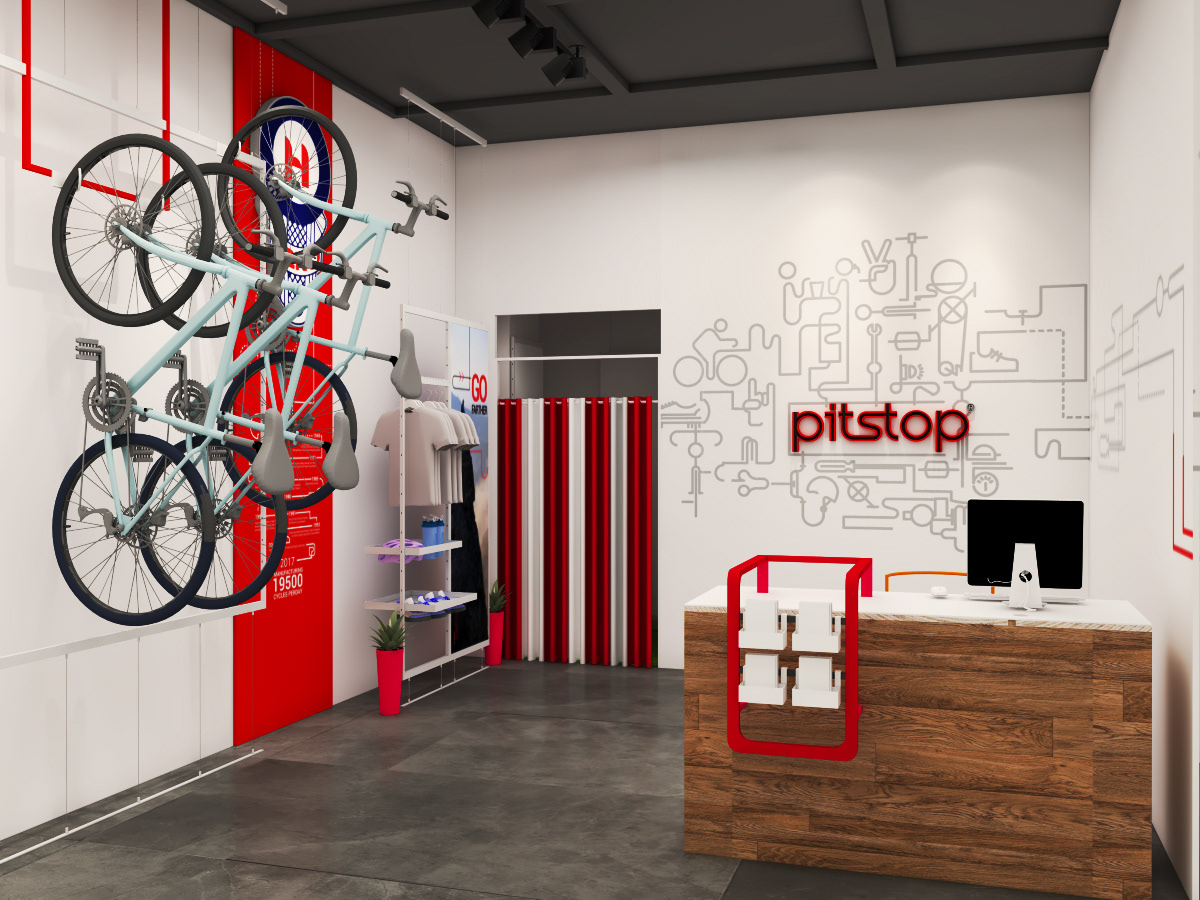
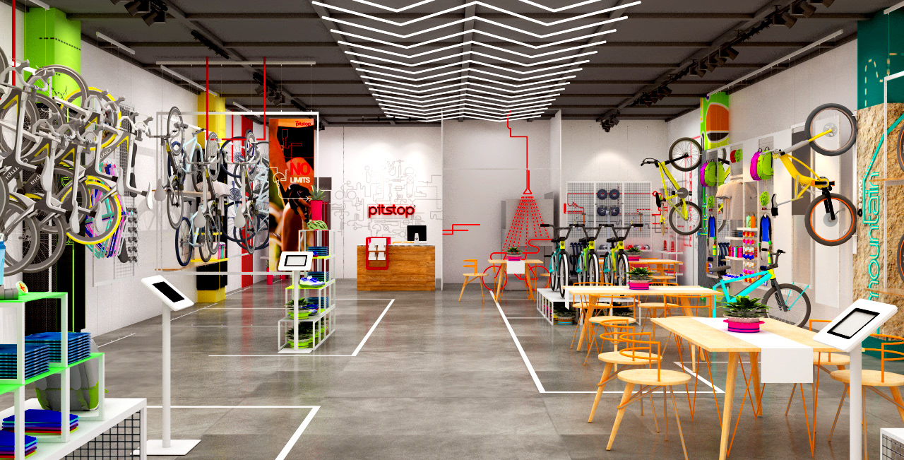
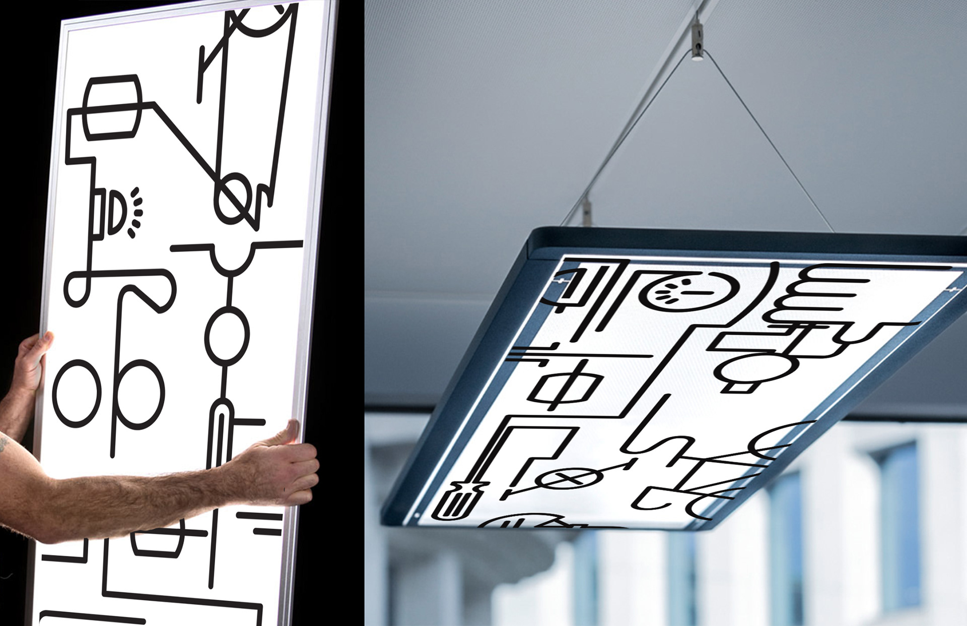
The lineart pattern was extended to various materials and treatments from being used as metal meshes to suspended light boxes in store, etched wood on cafe tables, relief graphics on wall and glass surfaces.
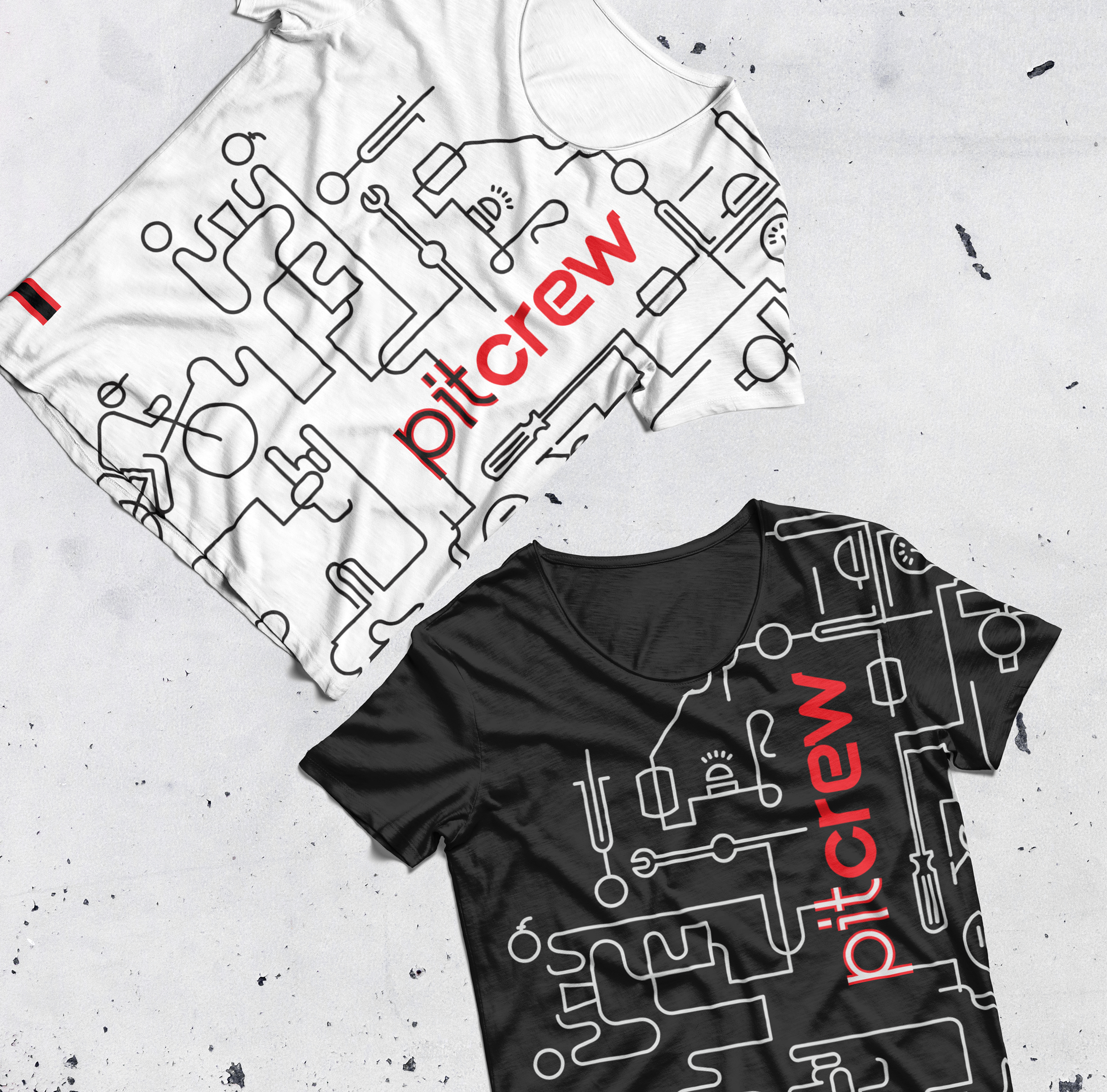
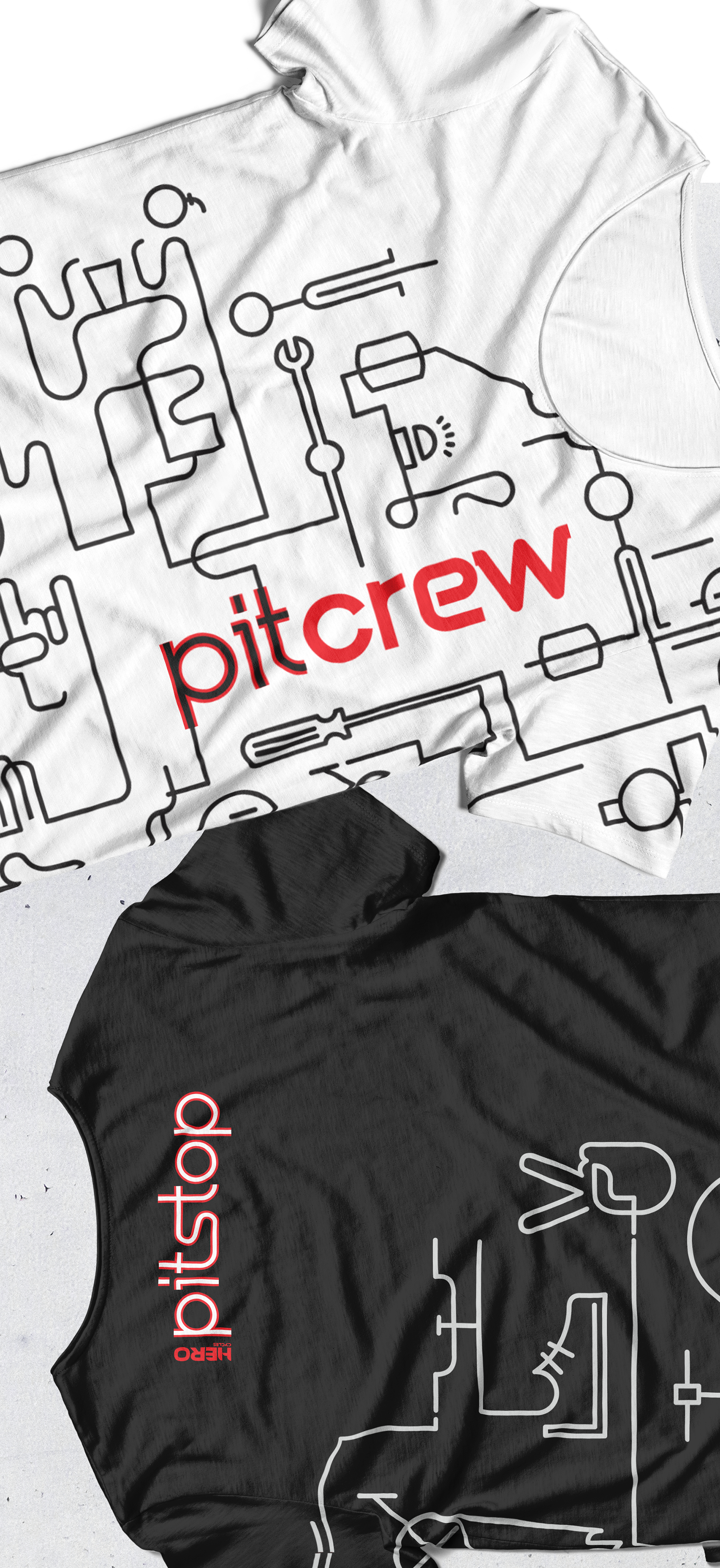
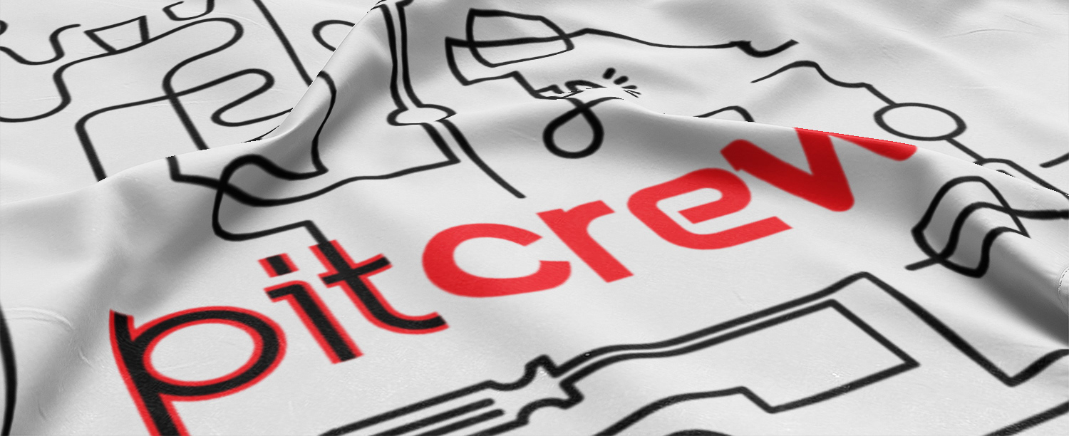
Brand merchandise
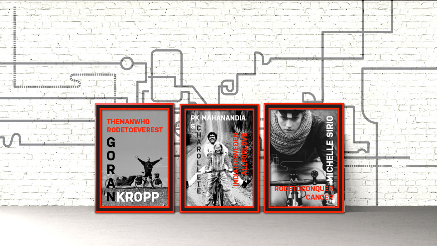
Branded Frames for retail Display.
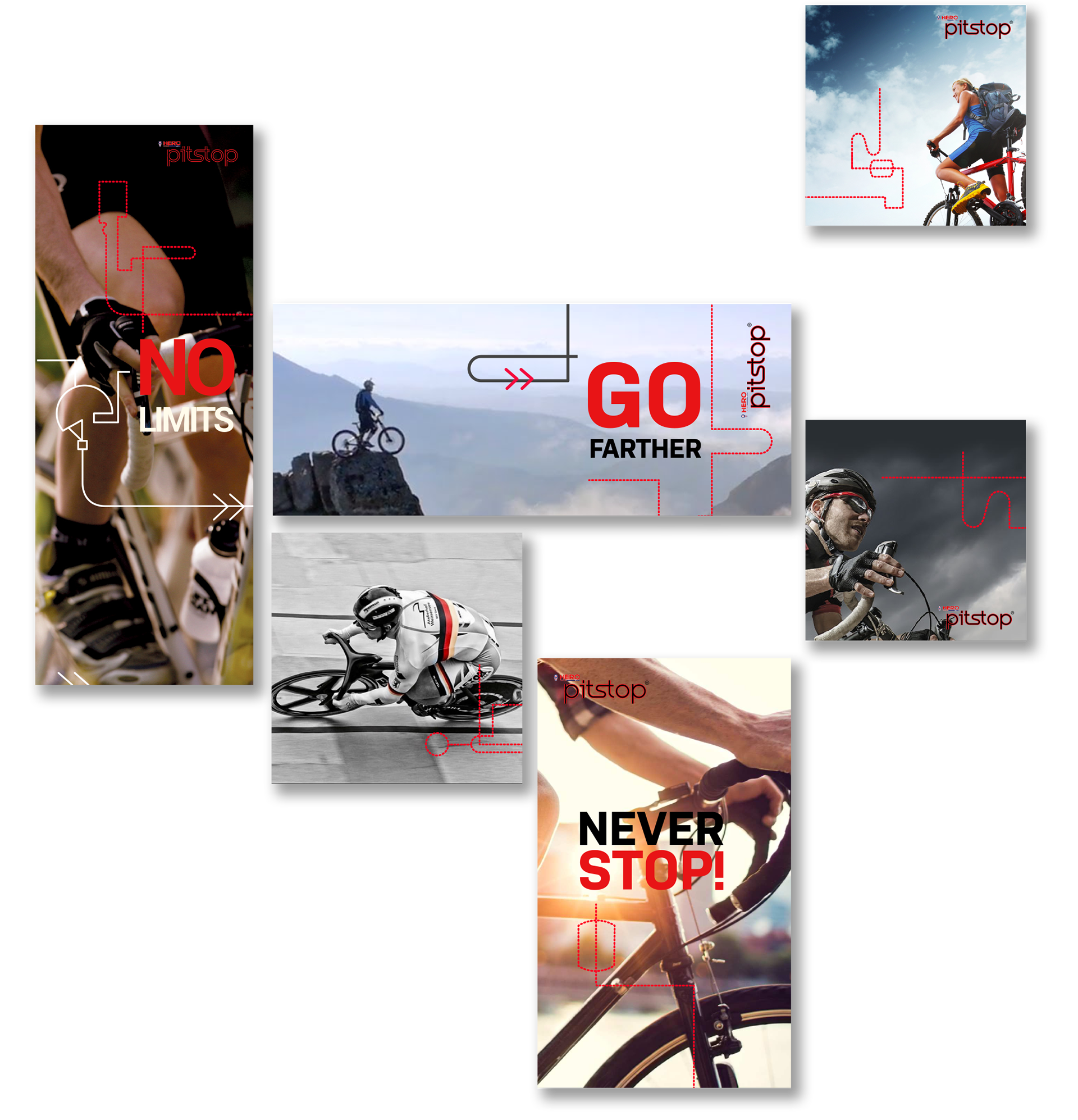
Sample communications layout for Brand Campaigns
Credits-
Graphic Designer- Priyanka Barcha Shroff
Retail Design - Hafsah Parker
3D Rendering - Anket Pagare
Copywriter - Smita Misra