LB INDUSTRIES
IDENTITY AND PRODUCT BROCHURE
PROJECT OVERVIEW
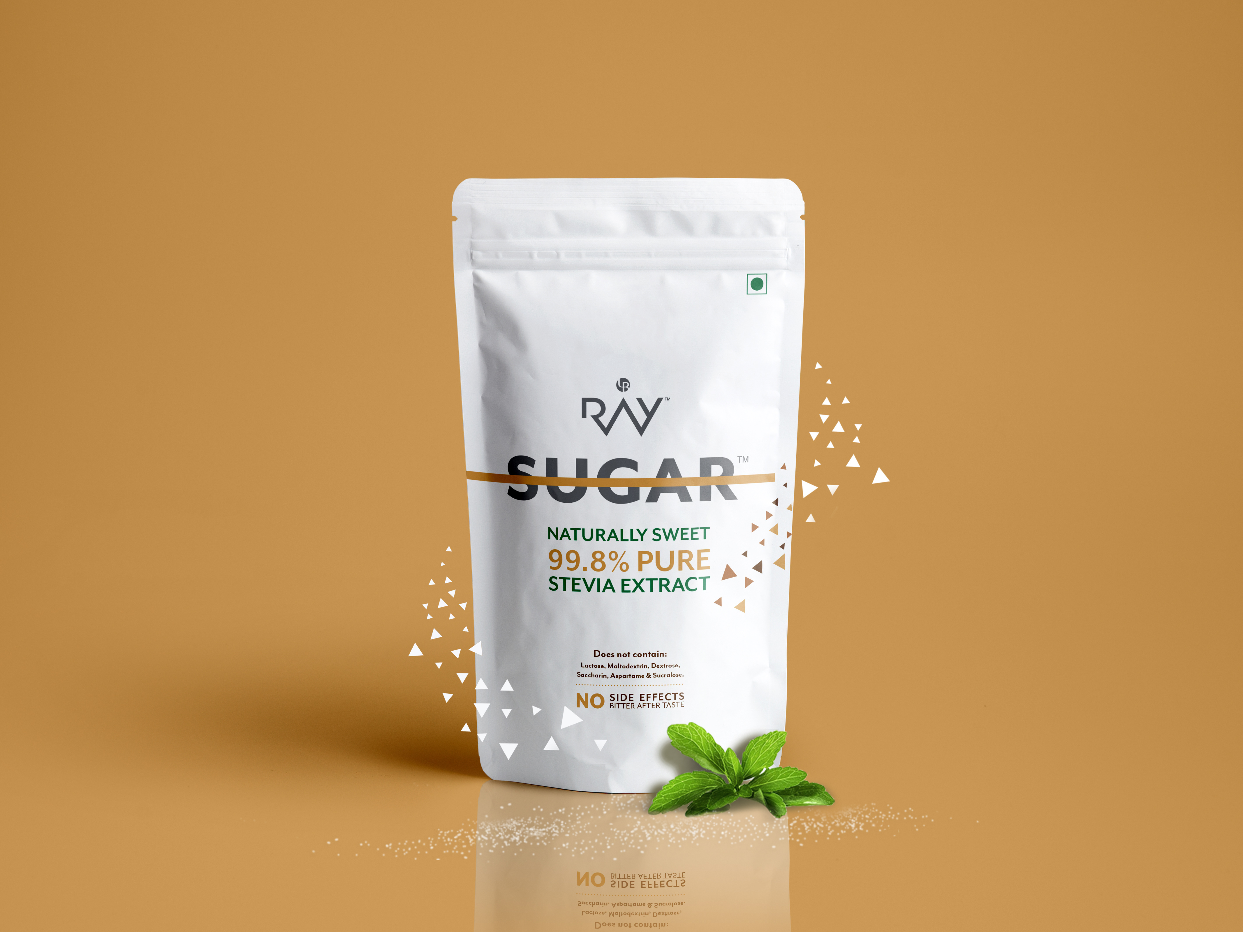
Nagpur based timber merchants - LB Group of Industries were transforming and diversifying their operations since 2016, moving into the FMCG space that promises to deliver quality brands under the existing LB banner. The group has various product ranges from food and beverages to personal well being products. LB required a new identity still retaining the existing brand mark, that conveys the the transformation both within the group's internal stakeholders, employees as well as customers, as it goes international with its product portfolio.
DELIVERABLES
A strategic positioning and branding identity system to developed for LB Industries, that is translated to the group's
web page, internal communications, and product portfolio that goes out to international distributors.
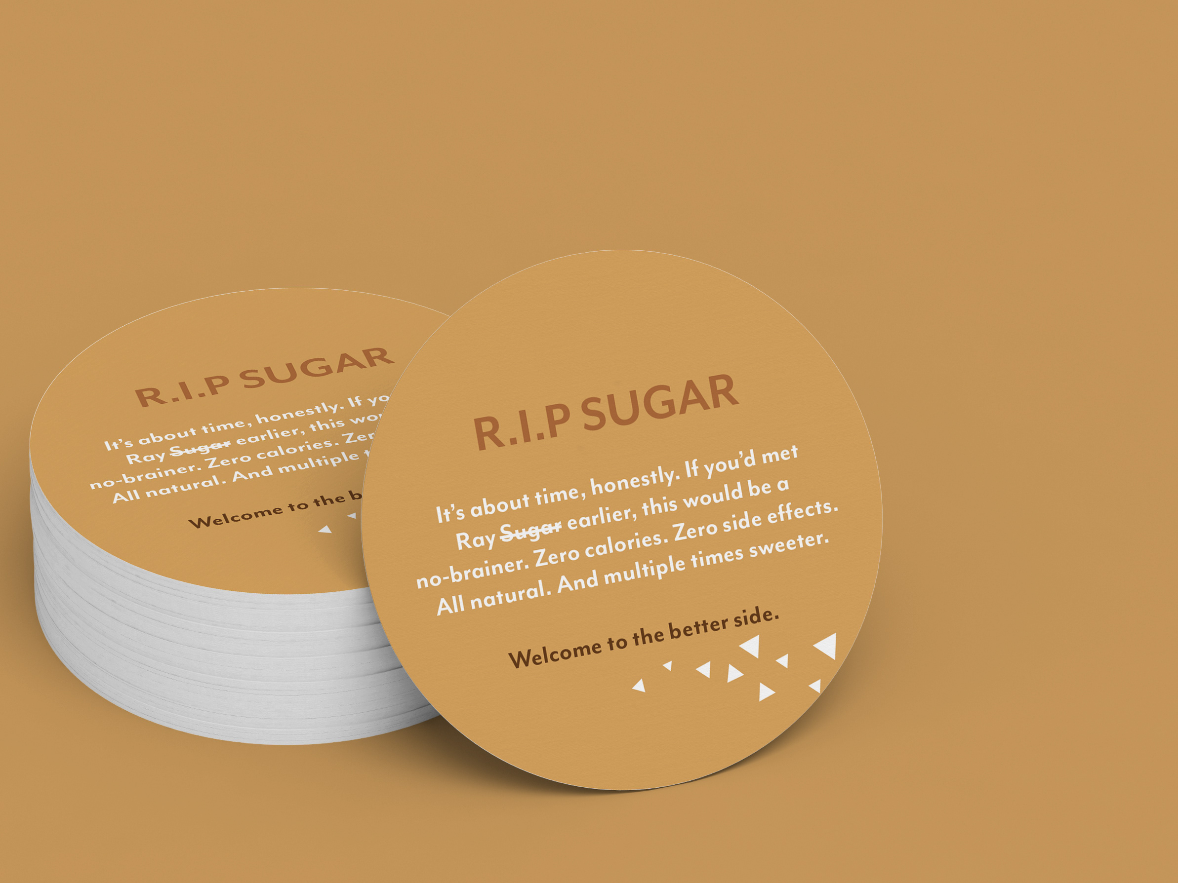
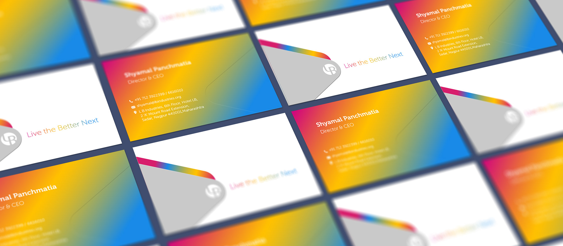
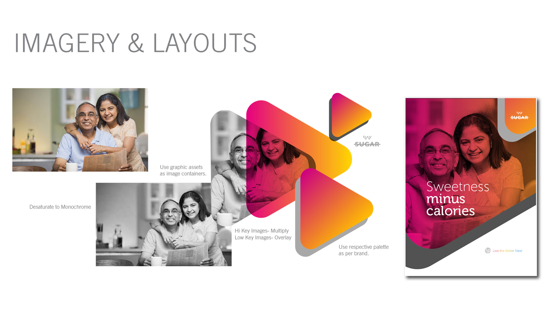
An adaptive secondary visual language was developed derived from the brand watermark and a dynamic visual language with ever changing colours.
VISUAL ASSETS AND STYLE GUIDE
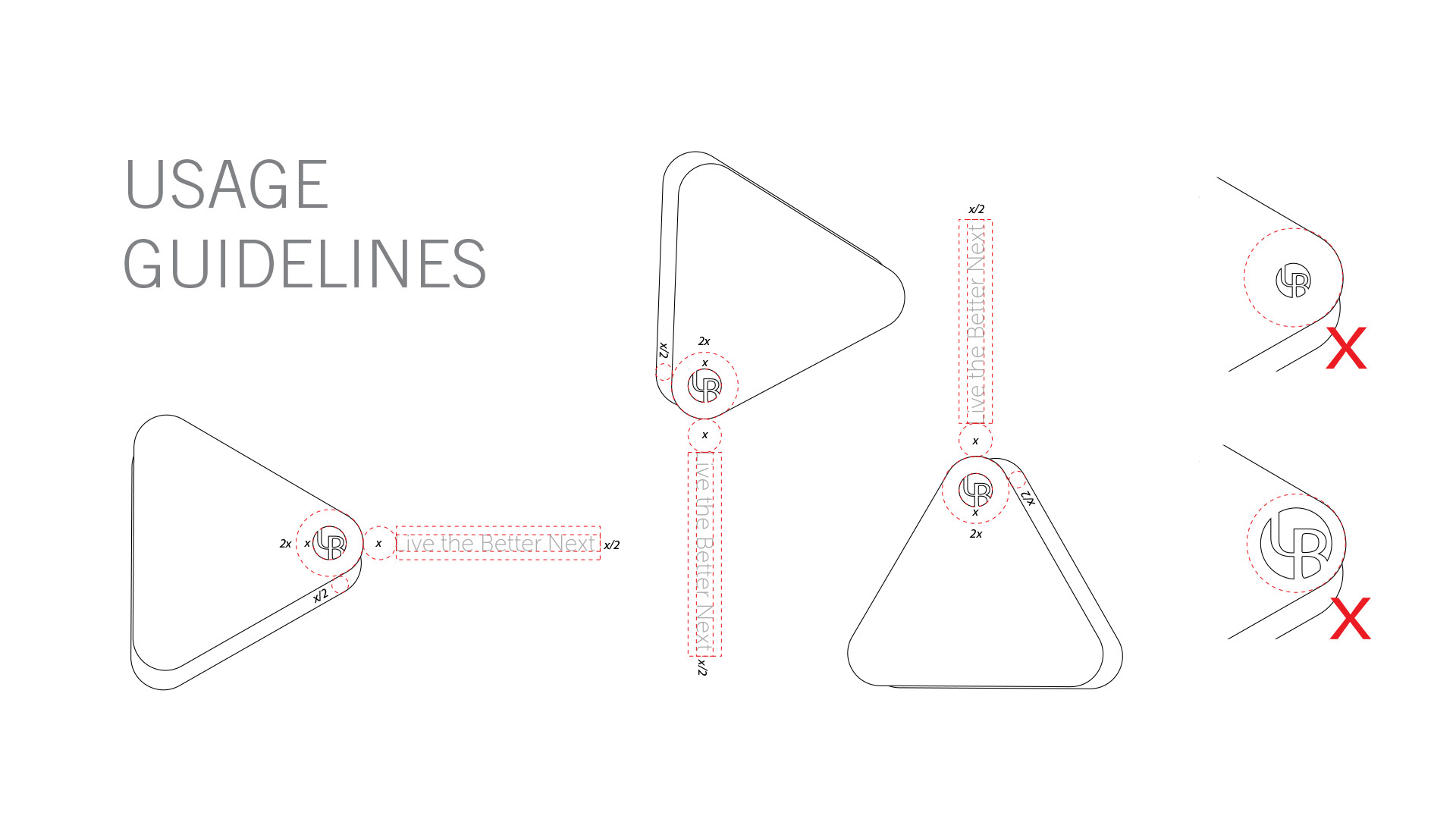

An ever changing yet subtle change in the colour signifies the continuous transformation and change.
MOTION
The round edged triangles move in left to right directions, to be used as transitions.
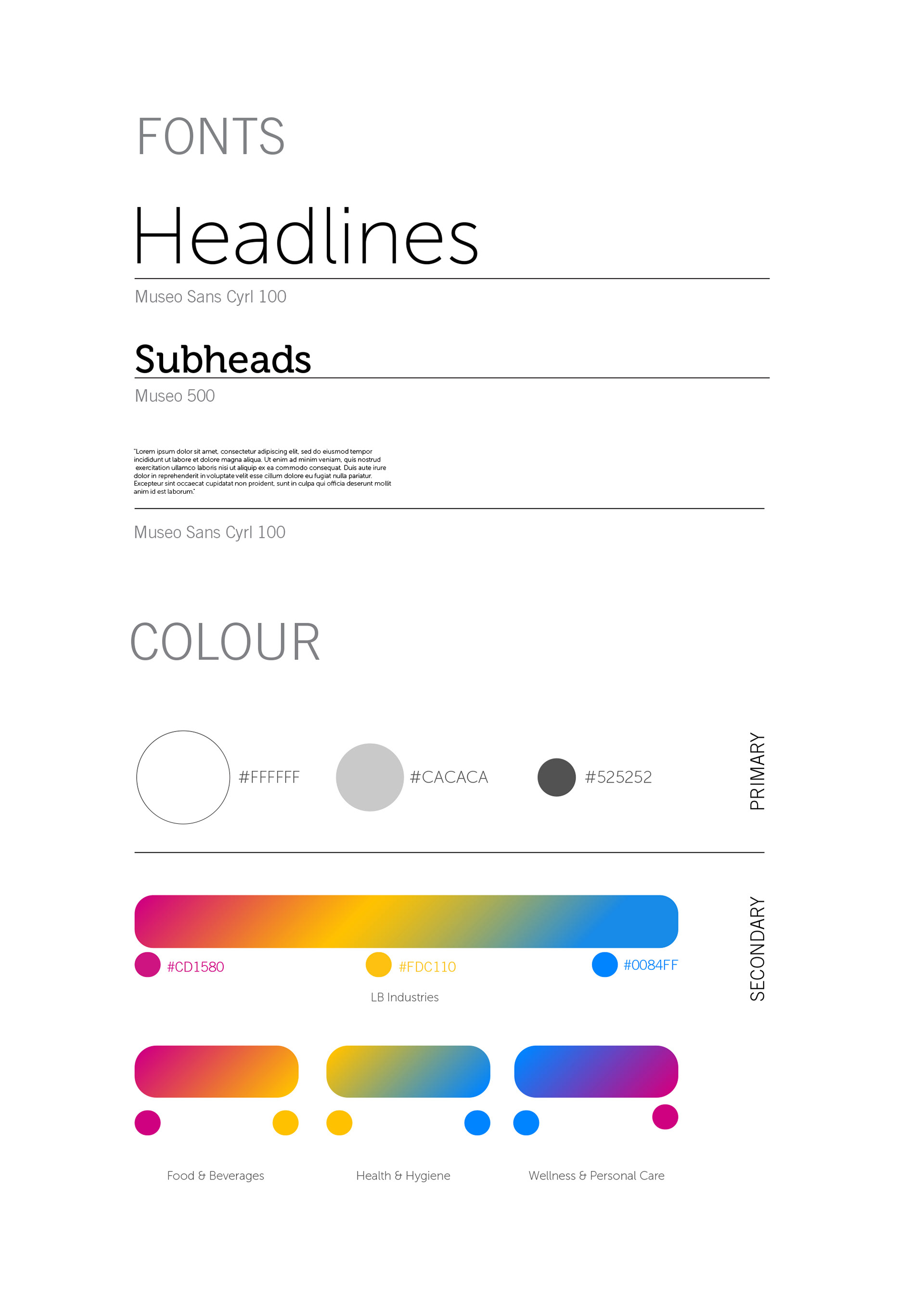
COLOR CODES


LB has a cradle of brands and is still transforming and expanding its portfolio still. A systematic colour coding index was developed under three major buckets. The visual system makes provision for further addition to the portfolio by introducing relevant gradient swatches.
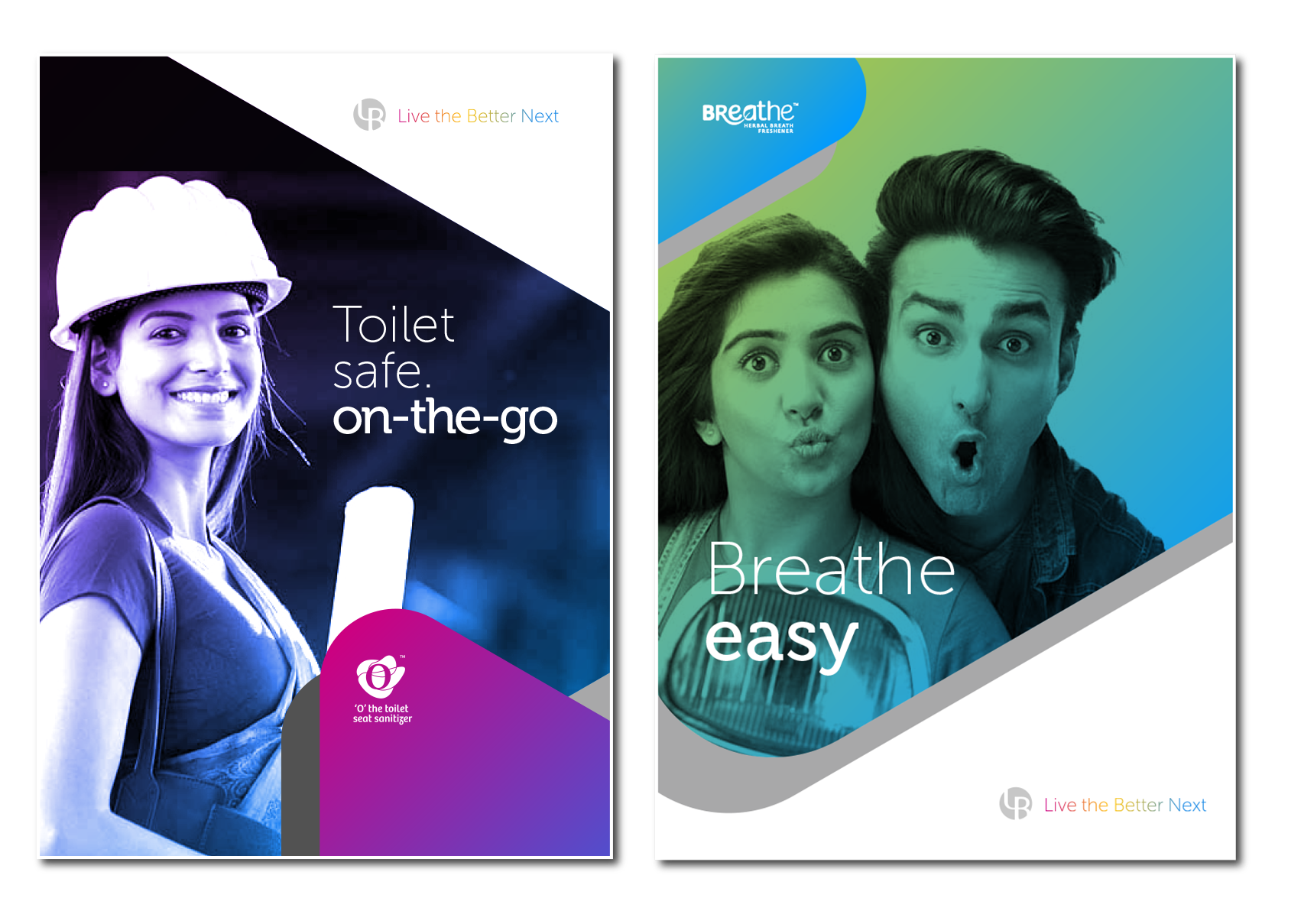
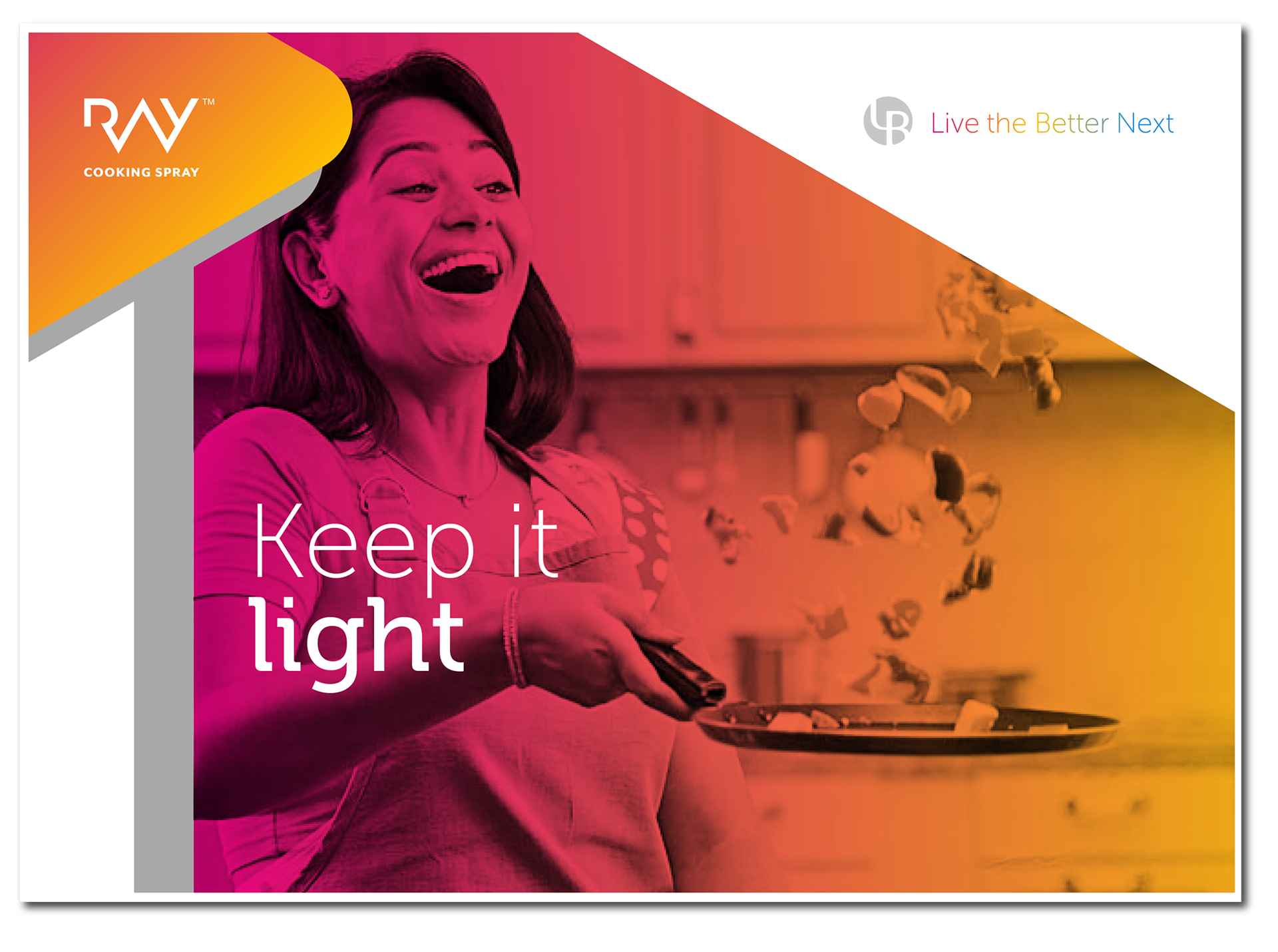
EXTENSION INTO BRANDING ELEMENTS
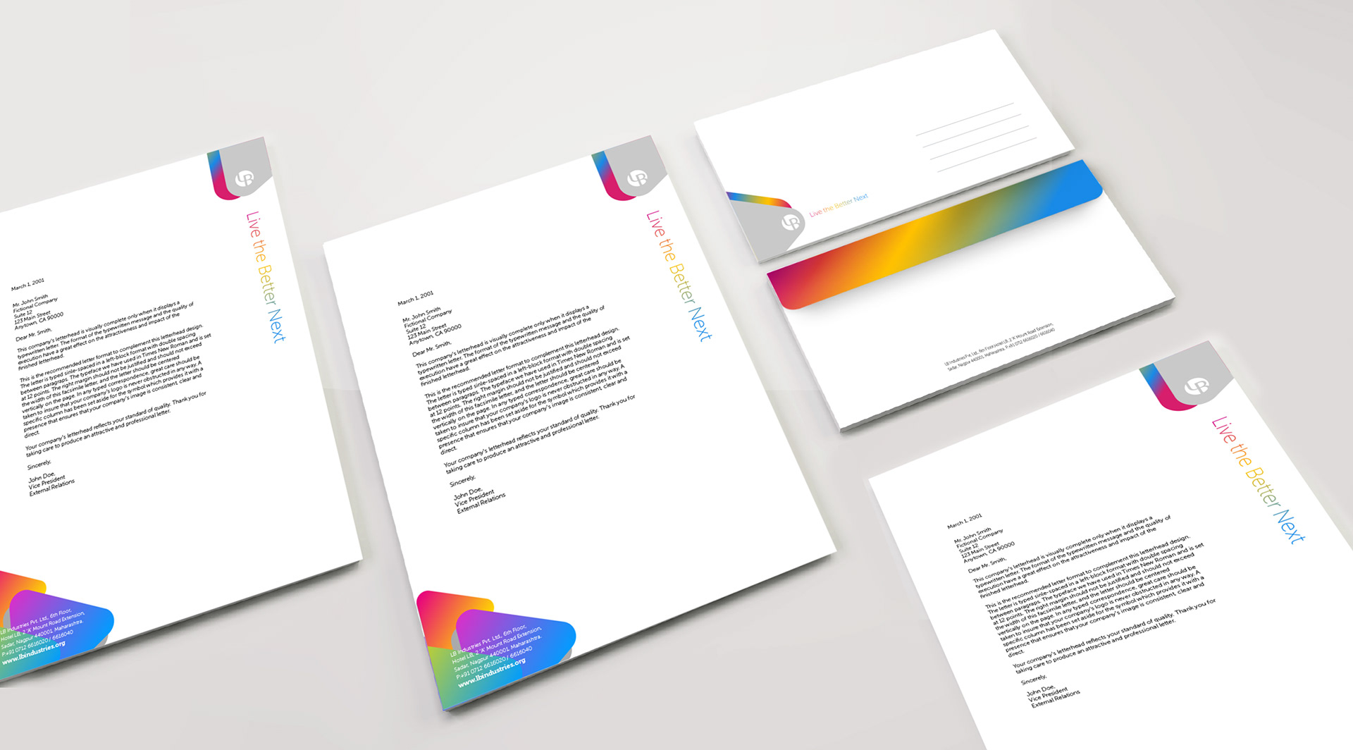
Layouts for Group's Communication collaterals.
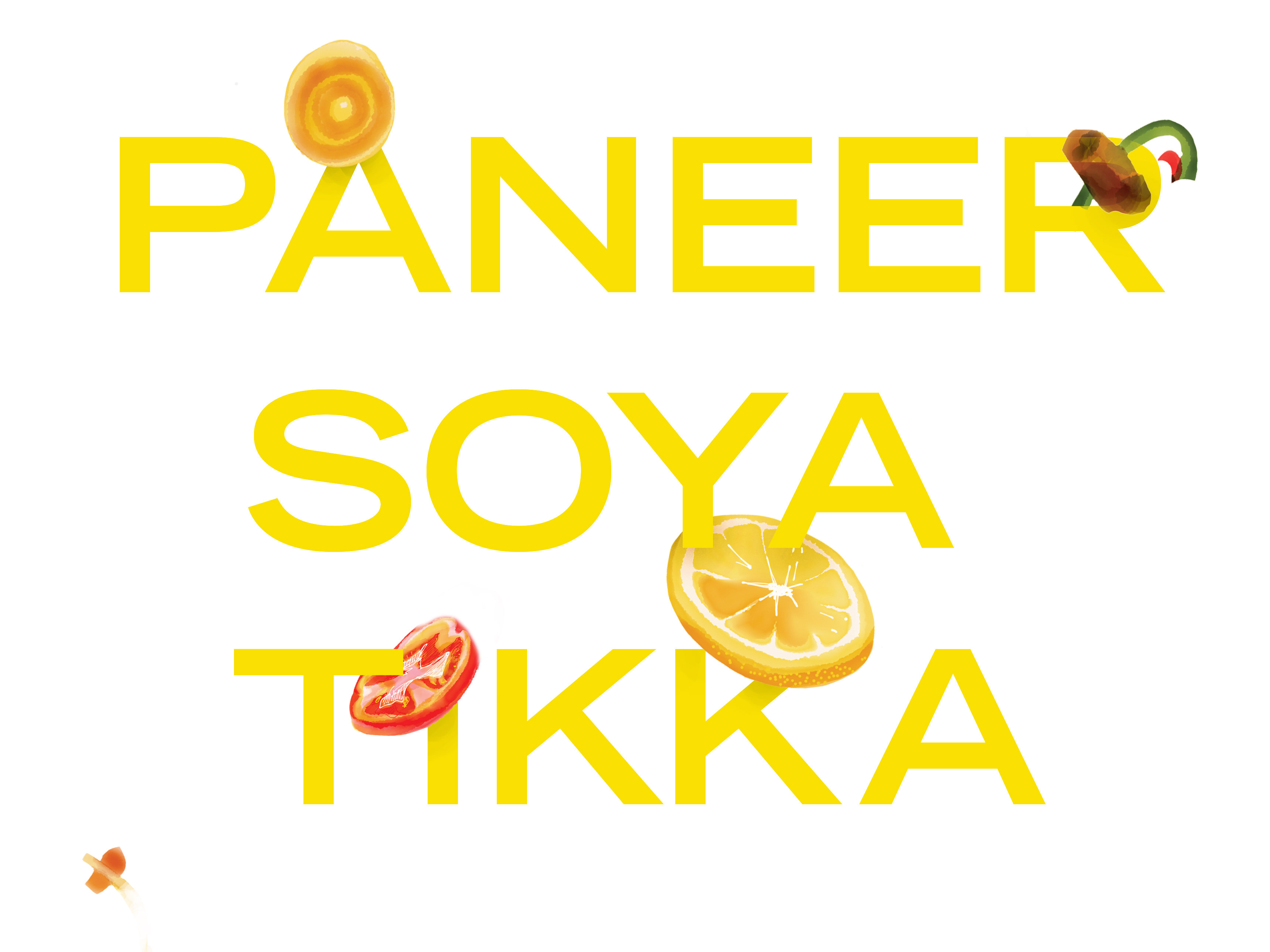
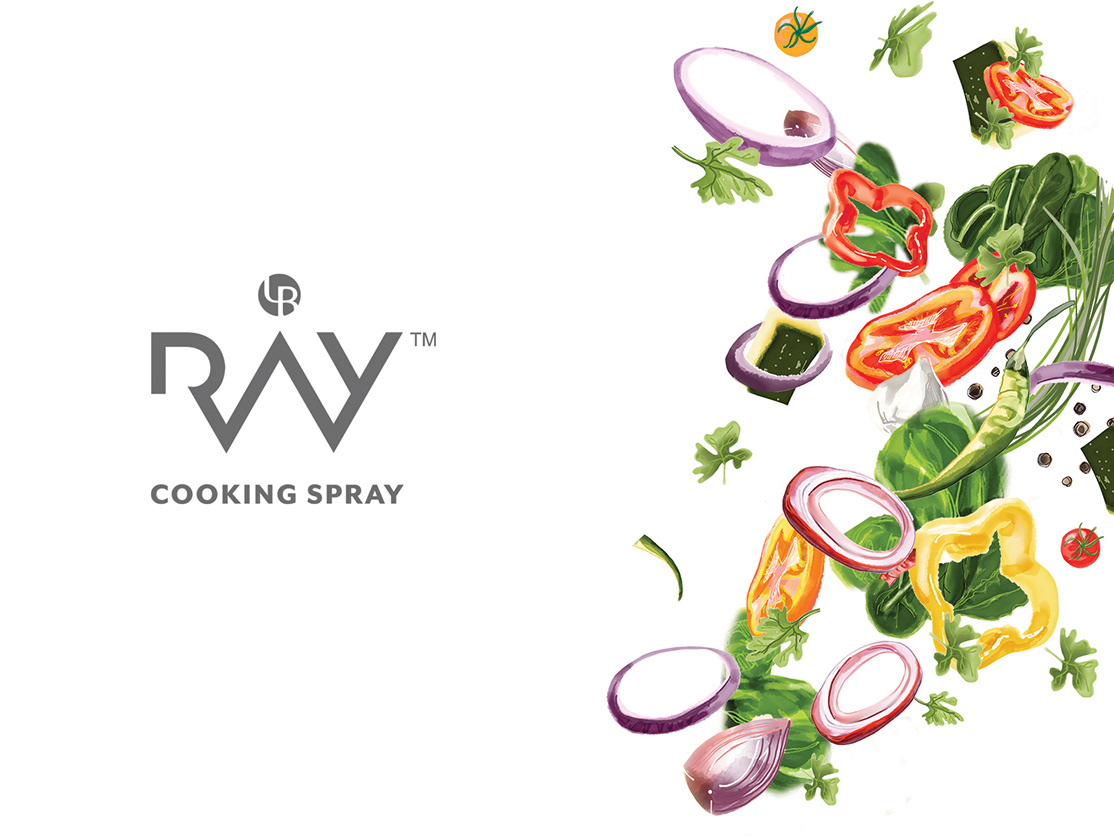
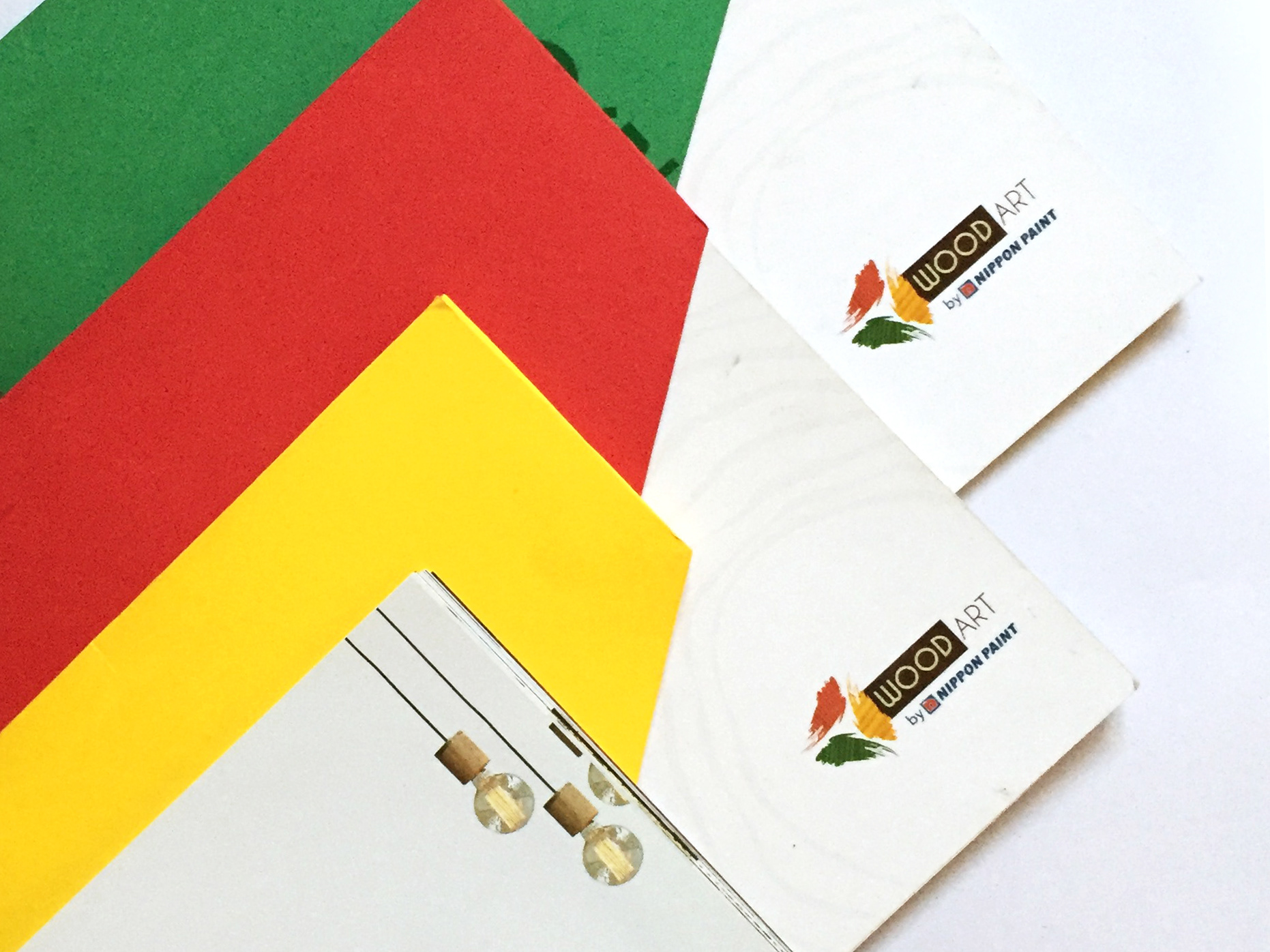
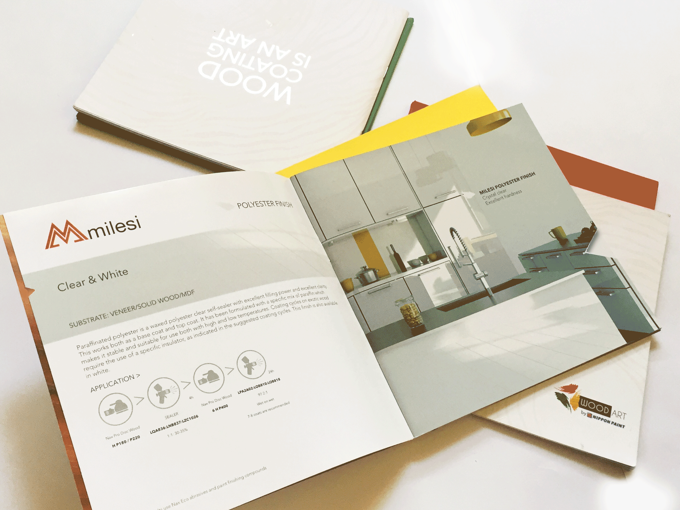
PRODUCT BROCHURE
Credits
3D Packshots - Anket Pagare
Copywriter- Smita Misra